When Jean-Claude Biver took over Blancpain to revamp it, one of the first things he did was to launch the 6 masterpieces, a range of 6 watches (from the most simple to the most complicated) housed in the same case. One of those watches was the moonphase, which combines an annual calendar with the display of the phase of the moon. This is a pretty classical complication which still exists (in a larger case) today in the Blancpain product range.
In the 80s Biver was already marketing the uniqueness of the movements, bringing forth technical arguments (the thinnest movement, the smallest minute repeater, …) to convince potential customers. The technical uniqueness of the movements is still a cornerstone of Blancpain’s strategy; however the way the message conveyed is less technical and much more emotional than before.
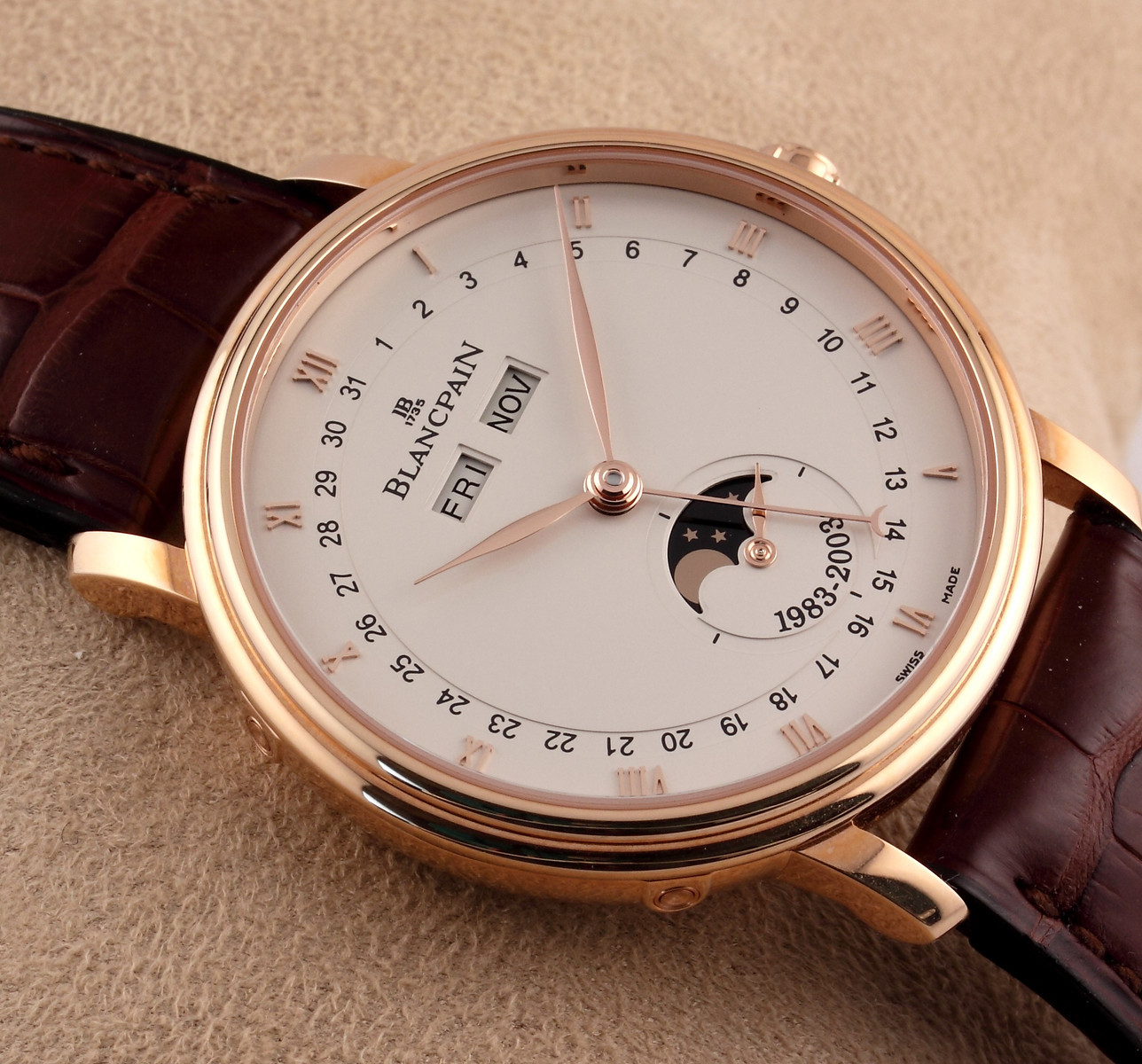
The rose gold version (Photo by Jeffrey Kingston)
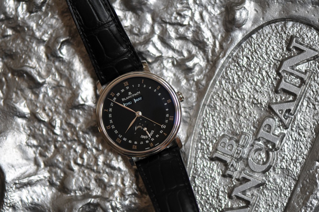
Let’s have a look at one contemporary example how Blancpain handles the customer experience and manages to create emotional ties with its customers. The best example I could find to explain why Blancpain is so unique is a watch produced in 2003 on the occasion of the 20th anniversary of the moonphase. This watch was presented at the Basel fair and was of course a limited edition (for those interested there were 300 pieces in red gold and 100 in platinum). Whereas for most brands the limited edition is sufficient in itself to create the uniqueness, Blancpain goes many steps further.
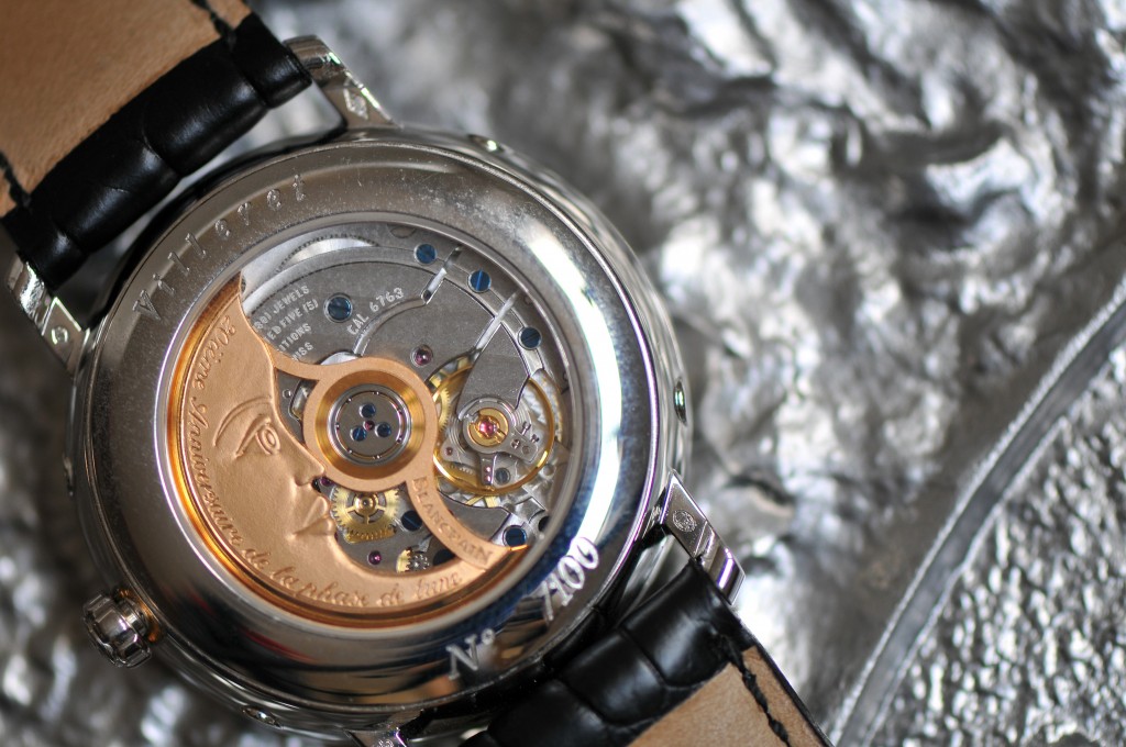
The platinum version
The platinum version
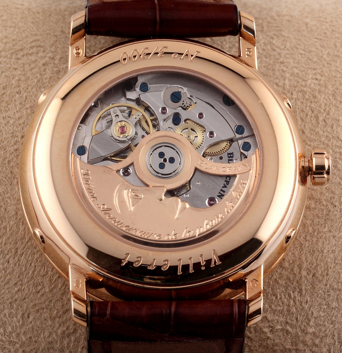
The rose gold version (Photo by Jeffrey Kingston)
I find this watch a very understated model which reinforces my belief that Blancpain appeals at connoisseurs (although I don’t feel I belong to the latter category). Two main features are emblematic of this watch; the first is on the watch; the second is off the watch.
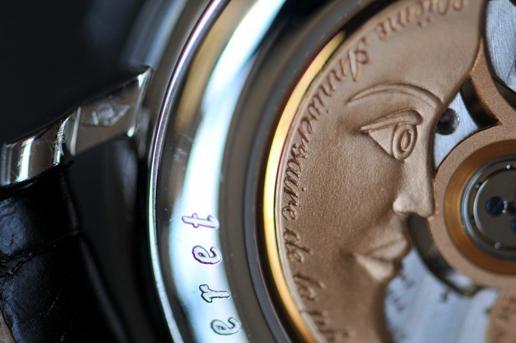
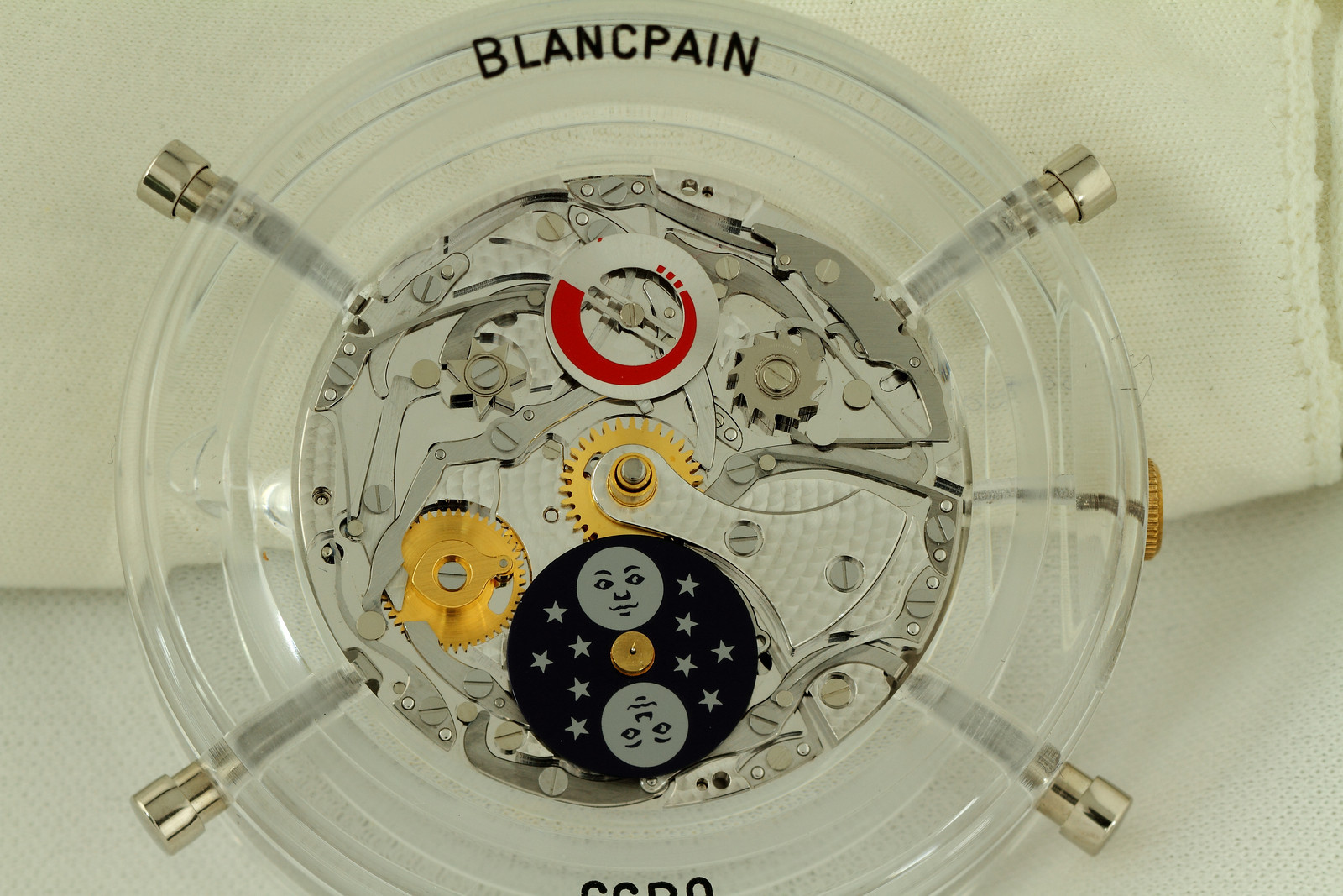
The on-the-watch feature is actually something that only the owner can admire. It is actually the rotor. It has become common practice to have see-through back on all watches of this category (even on fakes) but no other brand customizes the rotors that way (I had already reported on that in an earlier post). The rotor of this watch is hand-engraved to look like a moon (which is also a reminder of the face which was displayed on the moon indicator in the earlier versions of this watch). That is just pure luxury … no one can see it but the owner. I remember someone a long time ago telling me what luxury was: “a silver-plated gold jewel”. Well, it’s a little bit the same here.
The “man in the moon” (photo by Jeffrey Kingston)
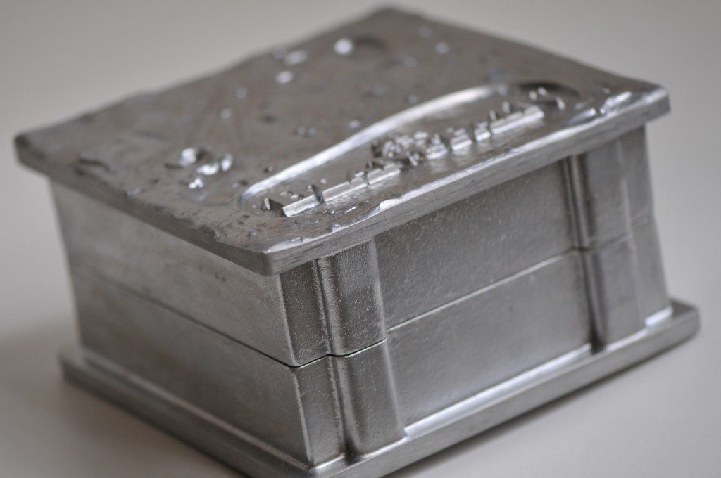
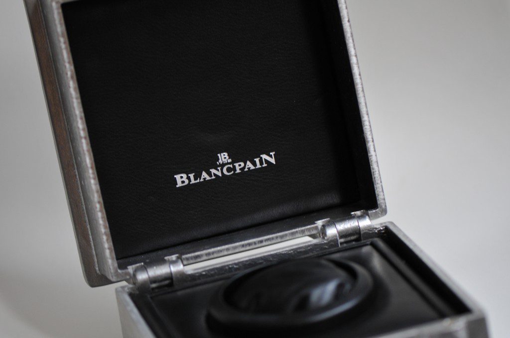
The second unique feature is the packaging. Blancpain has reached another dimension with its packaging concept. They actually wanted to reproduce the surface of the moon (which is already a challenge in itself) and to preserve the authenticity of the “Made in Switzerland” went so far as to ask the last aluminum foundry in Switzerland to produce the boxes which will eventually house the watches. Each box bears the number of the watch and makes therefore part of the set.


