Articles filed underDataviz
Data preparation: definition, examples, advice [guide 2023]
By Pierre-Nicolas Schwab •
To talk about data preparation, what better way to start than from observation. In the world of data, there is a rule that everyone knows: 80% of a data scientist's time is spent preparing his data, and only 20% working on…
![Illustration of our post "Data preparation: definition, examples, advice [guide 2023]"](data:image/svg+xml,%3Csvg%20xmlns='http://www.w3.org/2000/svg'%20viewBox='0%200%200%200'%3E%3C/svg%3E)
The 5 levels of data visualization: examples and advice [guide 2021]
After having written my guide to data visualization, I wanted to develop the 5 levels of data visualisation in a separate article that I briefly sketched in it. If you want to know where you stand in your BI (Business…
Data visualization: definition, examples, tools, advice [guide 2021]
Data Visualization, or DataViz, is the discipline that focuses on the graphical representation of raw data. The purpose of data visualization is to create value. The last few years have seen the emergence of new tools and practices around data visualization…
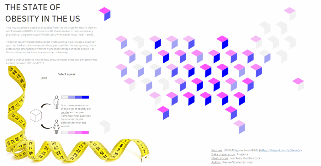
Tutorial: How to create a Joyplot using Tableau
By Pierre-Nicolas Schwab •
After having explained to you how to create an isometric hexmap, I now tackle a more difficult subject: creating a joyplot using Tableau. I used a joyplot in the visualisation I submitted to the IronViz. As this type of graph is relatively…
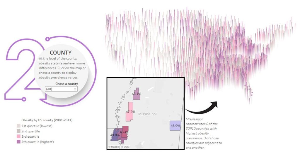
Isometric Hexmap using Tableau: a step-by-step guide
By Pierre-Nicolas Schwab •
As part of my participation in the Iron Viz 2020, I created a new type of visualisation using Tableau, which has received a lot of positive feedback. I called it 'isometric hexmap'. In this article, I explain how to reproduce…
![Illustration of our post "Data preparation: definition, examples, advice [guide 2023]"](/blog/app/uploads/desk-research-data-graphs-figures.jpg)
![Illustration of our post "The 5 levels of data visualization: examples and advice [guide 2021]"](/blog/app/uploads/The-Air-We-Breathe-IronViz-Final-1024x632.jpg)
![Illustration of our post "Data visualization: definition, examples, tools, advice [guide 2021]"](/blog/app/uploads/data-viz.jpg)