
![The 5 levels of data visualization: examples and advice [guide 2021]](/blog/app/uploads/The-Air-We-Breathe-IronViz-Final.jpg)
After having written my guide to data visualization, I wanted to develop the 5 levels of data visualisation in a separate article that I briefly sketched in it. If you want to know where you stand in your BI (Business Intelligence) practice and DataViz, this article is for you!
Sommaire
- Introduction
- Level 0 (no DataViz)
- Level 1 (are you still working in Excel?)
- Level 2 (Long live dashboards)
- Level 3 (Let me tell you a data story)
- Level 4 (That’s high art!)
- Conclusion (what if you pass level 2?)

Introduction
A good image is better than long speeches. This is well known and applies perfectly to data visualization.
Data visualization is this discipline, democratised by “business intelligence” and has made its transformation with the exponential increase in the volume of data and dedicated software solutions (PowerBI, Tableau, Spotfire, …).
If you have read the summary, you already know a little bit about what to expect in categorisation.
Before I start this article, allow me a short disclaimer for aficionados of R, Python, SAP BO, Qlik, etc … The purpose of this article is in no way to create a hierarchy between these tools. I limit myself to giving in my modest article some examples from my practice. Please do not see this as a malicious attempt to discredit these tools, but rather as an admission of my limitations.
Level 0: no data visualization
Definition: no graphic representation
Tools: PowerPoint (mostly)
What: Tables with figures and more figures
Who: still too many people
 The time for Excel tables is not yet over. There are still some for pasting tables full of figures into your month-end reporting. If you started last month and you only have 2 figures to show, I’ll give you that, that’s fine. But if you’re trying to make something a little more complicated, it would still be nice to make a small graph (like Level 1, not too complicated).
I looked through my archives again, and I didn’t have to search very far to find the first examples of these indescribable slides. And curiously enough, they were often the work of researchers presenting their work at scientific conferences. Once and for all … displaying messy figures and overloaded tables does not help make scientific work more credible.
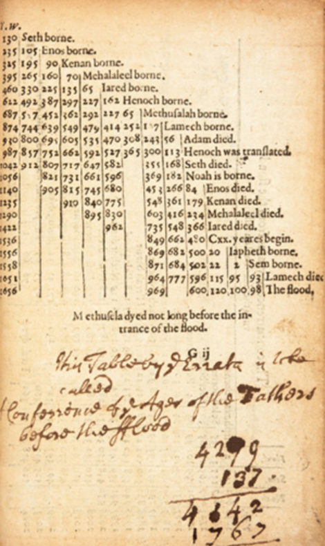
If you cut and paste an Excel spreadsheet, you’re at the same level as 500 years ago. And then again … In the example below the figures are arranged in a much more creative way than most of the DataViz I see.

Level 1: the Excel chart
Definition: representation of a one-dimensional variation
Tools: Excel
What: histograms, pie charts, curves…
Who: everyone in principle
Level 1 in DataViz is when a graph shows an evolution (temporal for example). This is quicker to understand than analysing a table full of figures, but it doesn’t go much further. Level 1 of DataViz saves you brain time. Most graphs made in Excel fall into this category.
There is no shame in using Excel to make a simple graph. Sometimes it’s even faster than using Tableau or PowerBI. What would be a shame would be to settle for a poorly made chart when Excel still allows you to do something cool.
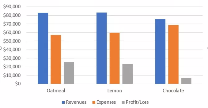
…when it is entirely possible, under Excel, to achieve a more qualitative rendering? Cole Nussbaumer Knaflic, in her book “Storytelling with data“, gives some good examples of this, such as the graph below.


Level 2: dashboards and correlations
Definition: representation of 2 or more variables on the same graph
Tools: Excel, PowerBI, Tableau, Spotfire, …
What: visualization of 2 or more variables to reveal correlations that would otherwise remain invisible, dashboards
Who: data analysts and managers
Level 2 of data visualization is preferably carried out in specialized software and allows you to go beyond a one-dimensional representation. Abscissa and ordinate axes can be combined with colour and size variations, giving the possibility of 4-dimensional visualization. Level 2 also includes the cartographic representations that allow the underlying links between the data to be captured.
Visualizations of this type populate the world of BI (Business Intelligence), which feeds on dashboards. Generally, they are the work of people who have a good command of tools such as Tableau, PowerBI, … but who do not have the technical background to go beyond standard representations. In their defense, I would say that it is also complicated, in some organizations, to come up with visual representations that are out of the ordinary. Indeed, some BI departments have been working for years without questioning themselves. Dashboards are served year-round to top managers unable to digest figures other than those to which they are accustomed. I have seen that even in organizations that claim to be data-driven, the lack of data knowledge of some top managers is a dead weight that muzzles the most gifted analysts. Peter’s principle is a living reality.
Since level 2 of the data visualization is where most people are stuck, let me go a little deeper into the subject.
It is quite possible to use Excel to create complex visualizations. But if you opt for the Microsoft tool, please keep in mind the advice given by Jorge Camoes in his book “Data at work“:
You don’t want your audience to think, “that’s an Excel chart” or, even worse, “Are we paying for Excel 2003 charts?” You want your audience to see the data, not the tool.
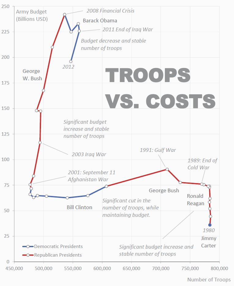
And indeed, when you see what Jorge Camoes manages to achieve with Excel, you quickly realize how far we are from the best (see below).
Jorge’s work and skills remain an exception. Most of the production of level 2 visualizations is done on BI tools. For a glimpse of the best in Tableau, go to the “Viz of the Day” page. There you will find dashboards like George Gorczynski’s “Shape of democracy”.

Power BI also offers a page of excellent examples of dashboards created with this tool. The dashboard below is atypical because the proposed radial visualization (a variant of the chord diagram) is rarely used, but here, it makes sense.


Level 3: data visualization becomes interactive
Definition: the user becomes an actor of his discoveries thanks to functionalities that allow him to interact with the visualization
What: data visualization in an interactive form; possibility for the user to explore the relationships between data himself
Tools: specialized tools for BI and DataViz
Who: data scientists and advanced data analysts
Level 3 of the data visualization adds the notion of interactivity. It requires some programming skills or advanced knowledge of specialized tools (Tableau, PowerBI, …) to exploit the latter to their full potential.
What is particular about level 3 is that the user becomes an actor of his discoveries around the data. For this interaction with the user to work, he must also add a “storytelling”. Generally, this is done through different visual layers which, one after the other, allow the user to immerse himself in the data and become autonomous. The user no longer passively consumes graphs and visual representations proposed by others. He discovers for himself by selecting specific data, varying scales, zooming in, etc… In short, he is no longer passive and takes ownership of the data, which increases his ability to use it in other environments.
Here are some examples of Level 3 DataViz. Watch your eyes!
Christian Felix’s work won him the Iron Viz 2020 with the visualization below. I invite you to “play” with the data yourself by going here.
Alexander Varlamov’s Joy Plot is also remarkable. It is cleverly combined with geographical representation to reveal insights. Click here to play with the data.

In a visualization dedicated to migrations towards the European Union, I modestly tried to get closer to level 3 and repeated the exercise during the IronViz 2020.


Level 4: Art and data visualization go hand in hand
Definition: an aesthetic dimension is added, sometimes to the detriment of the functional aspect
Tools: Illustrator, Photoshop, in combination with technological tools
What: the aesthetic dimension of the data visualization preferred, sometimes to the detriment of the functional aspects.
Who: data artists, graphic designers
Level 4 of the data visualization is a different level, which goes beyond the superficial, functional needs covered by the previous levels. Level 4 adds an aesthetic dimension to data visualization. It must be beautiful, even if it means losing interactivity or making the message less obvious to understand. This type of visualization is generally carried out with tools other than those used in companies. Indeed, the Tableau, PowerBI and other Spotfire are not designed to “create Beauty” but instead create efficiency. Consequently, level 4 requires tools such as Photoshop or Illustrator. In this category, we also find video animations and other innovative and captivating formats.
Here are some examples of visualization that fall under level 4.
Music visualization in the form of video (Nicholas Rougeux)
Nicholas Rougeux had the idea of representing pieces of classical music in data form. He used .mdi files to convert the music into data and then tested different types of visualization. The final result is a circular representation that allows the various movements, octaves and note lengths to be understood. Find his explanations in the video below.
Poetry and data can go hand in hand (Federica Fragapane)
What characterises Federica Fragapane’s work is undoubtedly an innate sense of lightness and elegance. Through a subtle choice of shapes and colours, Federica succeeds in infusing certain poetry into her work. She collaborates in particular with the cultural section of the Corriere Della Serra. You can also discover her work via her Instagram account.
A data visualization at the service of democracy (Karim Douieb)
Karim Douieb enjoyed a unique glory in the apocalyptic period following the American elections. A visualization he created in 2019 was reused to counter the arguments of the Republican camp. The latter was trying to pass off the election results as a red tide. Karim’s animation made the buzz because it shows fascinatingly, that there is no link between the extent of the territories that voted Republican and the number of people who live there. I thank Karim for lending me his video for this article.
Conclusion
This article has presented you with a classification of the different types of data visualization. The explosion in the volume of data available has led to the birth of specialised software solutions such as Tableau, PowerBI, Spotfire. However, many visualizations are still carried out with Microsoft Excel (Level 1), and those who use specialised software often stick to very conventional data visualization (Level 2).
While level 4 is aimed at particular experts with a good command of graphic tools, I think that level 3 is within everyone’s reach. Going beyond dogmas and reaching level 3 will allow you, in particular, to make your work stand out. To achieve this, you will have to put yourself in the user’s shoes and tell them a story in which they will be heroes. Add interactivity to your DataViz, design them like treasure maps. Users will feel smart and become addicted to your work.