After having explained to you how to create an isometric hexmap, I now tackle a more difficult subject: creating a joyplot using Tableau.
I used a joyplot in the visualisation I submitted to the IronViz. As this type of graph is relatively rare, and I’ve had some trouble getting it right, I thought a tutorial would be welcome.
Summary
- Definition of joyplot
- Origin of the name “Joyplot”
- Tutorial on how to create joyplot using Tableau
- Some additional thoughts
What is a joyplot?
The joyplot (or “Ridgeline plot”, see the origin of the name in the following paragraph) consists of the vertical juxtaposition, on the same horizontal axis, of histograms, distribution curves or time series.
This type of data visualisation is particularly useful for comparing statistical distributions or showing differences between time series.
The (misuse) I have made of it in Tableau uses the peaks of multiple distribution curves to give the illusion of a geographical visualisation. The inspiration came from the work of Alexander Varlamov, whose tutorial I followed.
The origin of the name “Joyplot”
 It was while researching the construction of the joyplot that I discovered the origin of this name. Konstantin Greger explains on his blog that the name derives from the illustration on the album “Unknown Pleasures” by the English band “Joy Division” (active from 1976 to 1980). My lack of “rock” culture had made me miss this band whose melodies were nevertheless known to me: “Love will tear us apart”.
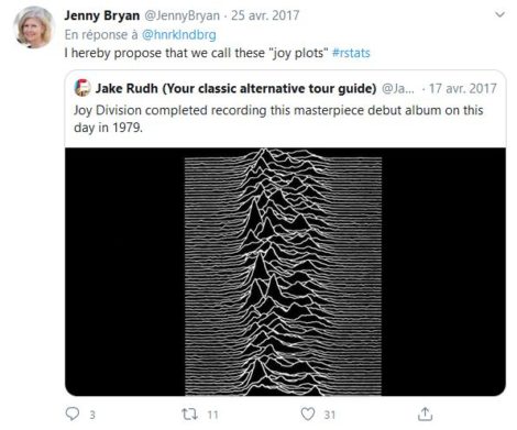
The name “joyplot” seems to appear in 2017 after Jenny Brian suggested the name in reference to the Joy Division album.
A mini polemic ensued because “Joy Division” was the name given to groups of Jewish women meeting the sexual needs of Nazi soldiers in concentration camps. Since then, the term “Ridgeline plots” has been proposed. For a fuller discussion, I recommend this excellent article.
A step-by-step guide to creating the joyplot using Tableau
Of course, making a “classic” joyplot using Tableau is no problem at all. This becomes more complicated when you want to divert the joyplot to represent peaks of density within a geographical area.
This is the challenge of this tutorial, which will allow you to use the joyplots to make a map like the one below.
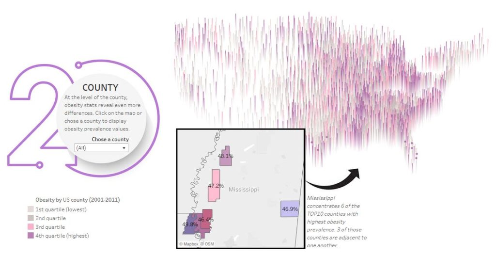
In the following paragraphs, you will find all the explanations necessary to reproduce, step by step, the same type of visualisation as the one shown above.
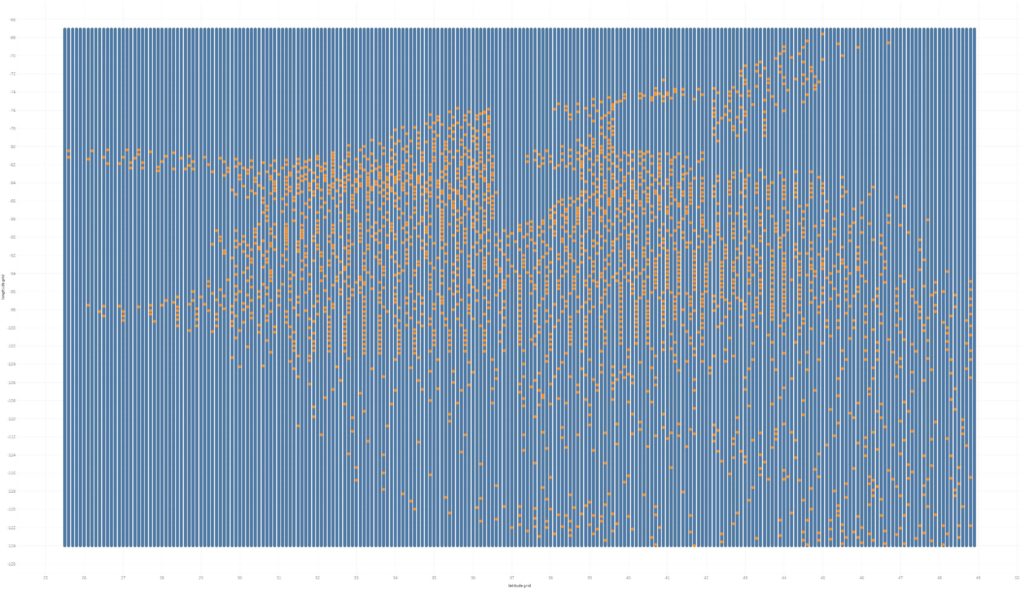
To understand the principle, it is necessary to bear in mind that behind this type of visualisation, there is a “grid”, some points of which are associated with a value and others are not.
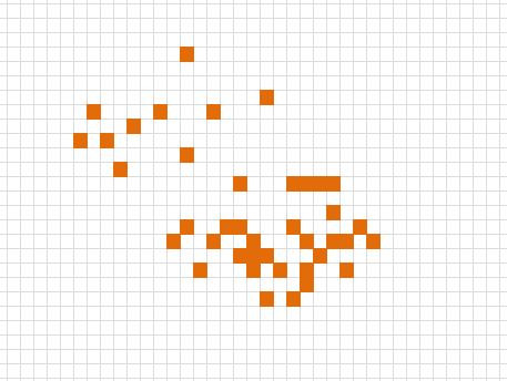
A “peak” will be displayed only for the squares that are associated with a value (the meshes coloured orange on the diagram opposite).
That being said, it is time to get down to business.
Step 1: processing of latitude and longitude
The first thing to do is to round-up the geographical coordinates (latitude, longitude) of your points to fit them into the grid. This requires some thought beforehand about the “step” to adopt. A step that is too fine could “wedge” the table. A step that is too wide will not give a visually successful result.
For my visualisation of the obese population by county in America, I had initially opted for a 0.01 step. I was following Alexander Varlamov’s advice. Such a slight step works for small geographical areas (on the scale of a city, for example) but not for a country as large as the United States. So, I fell back on a step of 0.1.
After having made an internal join on the centroids of each county, all that remains is to apply a rounding-up. The resulting calculated variables are called LatRound and LongRound.
LatRound = ROUND([Latitude],1)
LongRound = ROUND([Longitude],1)
Step 2: the creation of a coordinate grid
The second step is to “densify” the data in Tableau by creating a grid. The coordinates of the grid cells will be used to associate the values for obesity by county.
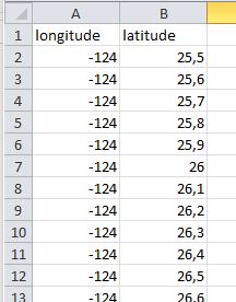
To create this grid, create a table in Excel, which will include the values of longitudes in the rows and latitudes in the columns. A small pivot later, and you get a table like this one. Don’t forget to check which are the minimum and maximum values of latitude and longitude that you need.
Then just make a right join on this Excel table. The join on the right allows to keep the meshes for which no value is associated empty.
The latitude and longitude values of the grid are respectively called “latitude grid” and “longitude grid”.

Step 3: elimination of empty points outside the geographical area
In the next step, we will eliminate the points that are outside the geographical area we wish to cover. This is particularly important if you want to reconstruct the borders of a country, for example.
Let’s start by visualising which grid cells have no values associated with them. The following calculated variable makes it very simple to do this.
NullDotCheck = IIF(ISNULL([Obesity prevalence (%)]),TRUE,FALSE)
Using this calculated variable as a guide for the colour, we obtain this. The borders of the United States are slowly beginning to emerge, but there is still some work to be done.
We are now going to eliminate all points that are outside the geographical limits of the United States. LOD expressions allow us to do this quickly. We create the calculated variable “NullDotFilter” as follows:
[longitude grid]< { FIXED [latitude grid]: MIN({ FIXED [latitude grid], [longitude grid]: MIN(IIF(ISNULL([Obesity prevalence (%)])=false,[longitude grid], NULL))})}OR[longitude grid]> { FIXED [latitude grid]: MAX({ FIXED [latitude grid], [longitude grid]: MIN(IIF(ISNULL([Obesity prevalence (%)])=false,[longitude grid], NULL))})}
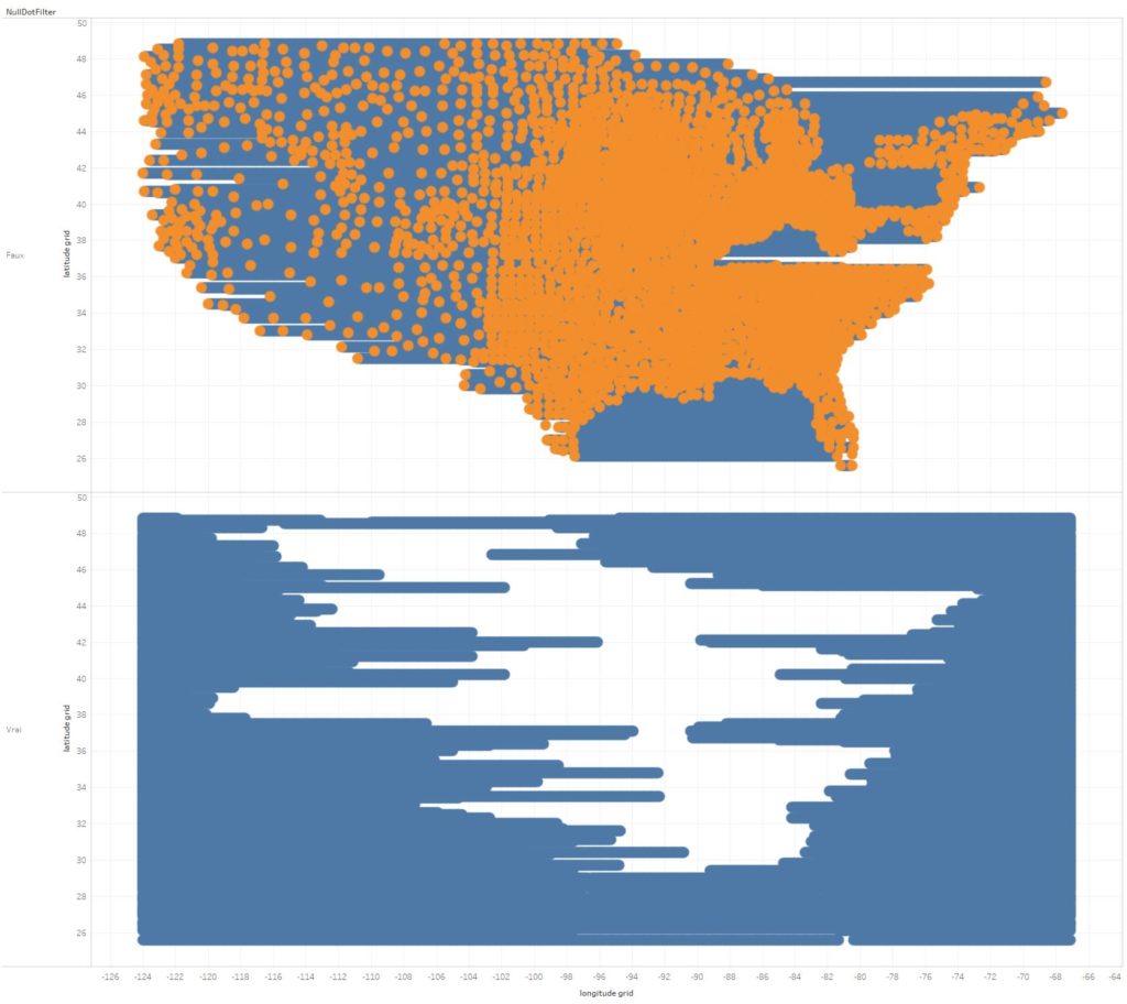
Once the “NullDotFilter” variable is applied as a filter, you get (top) a visualisation that starts to look like the United States.
You can see at the bottom that the map is made from horizontal lines drawn at 0.1 degrees of latitude from each other. Since there are still some empty grids within the territory (blue dots on the upper part of the graph), these dots must be placed on the correct line of latitude. I have therefore created a “zero data” calculated variable:
zero data = IFNULL([Obesity prevalence (%)],0)
Let’s now move on to the most fun part, the programming of the “peaks” of the Joyplot.
Step 4: Height of the peaks
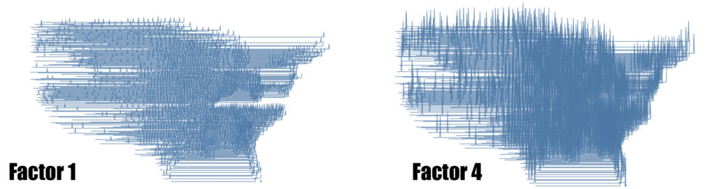
The calculated variable “Y” is created so that the height of the “peak” is a function of the value assigned to each point on the grid. In my case, the exercise proved more complicated than expected because the values I processed (percentage of obese people per county) were relatively close to each other.
Y = max([latitude grid])+(4 * (SUM([zero data]) / WINDOW_MAX(SUM([zero data]))))
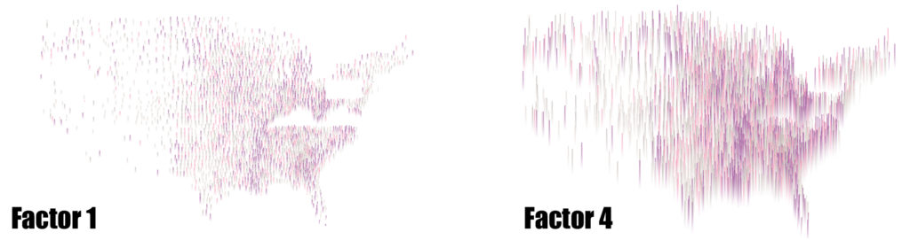
To artificially increase the differences between peaks, I have introduced a value factor of 4. Below you can see the difference between a factor of 1 and a factor of 4.
Don’t forget to put the variable “latitude grid” in detail (as a discrete value).
Even so, the differences were not very visible. This led me to apply colours in the form of quartiles.
Step 5: colours according to the quartile
To make the differences more visible and to eliminate worthless grid meshes, I opted for a quartile colouring. The 1st quartile will correspond to 0 and can be assigned to the background colour of the dashboard. I have already explained the technique and its origin many times (see in particular my tutorial on the isometric hexmap).
rank obesity US counties = {FIXED [Year],[County] : AVG([Obesity prevalence (%)])}
rank percentile counties = RANK_PERCENTILE(AVG([rank obesity US counties]))
rank color by quartile =
if [rank percentile counties]<=1/[quantile]then 1/[quantile]ELSEIF [rank percentile counties]<=2/[quantile]then 2/[quantile]ELSEIF [rank percentile counties]<=3/[quantile]then 3/[quantile]ELSEIF [rank percentile counties]<=4/[quantile]then 4/[quantile]END
The “rank colour by quartile” variable, therefore, allows us to colour our peaks to make them more visible.
Some additional thoughts on the Joyplot
The joyplot is undoubtedly not the most straightforward visualisation to create using Tableau. It is also far from being suitable for business-oriented applications. However, as Alexander Varlamov pointed out, its use for journalistic purposes is ideal. Indeed, the joyplot is visually attractive, easy to understand, and therefore lends itself to informing the general public.
For the sake of efficiency, however, I advise you to check before you start that the data you want to visualise take on very different values from each other. The most appealing joyplots will be obtained when there is a large dispersion of data. In hindsight, I also think that applying the joyplot to vast territories is likely to give inferior results. The representation of evictions in the region of San Francisco (see here) seems to me to benefit significantly from the use of the joyplot.