In an earlier article we started dealing with examples of attractive visual displays in the retail industry. We argued that product arrangement influences information processing by customers and in return purchase decisions.
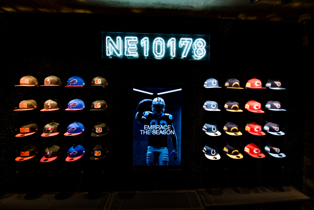
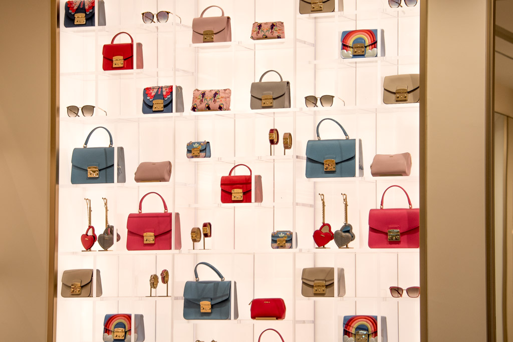
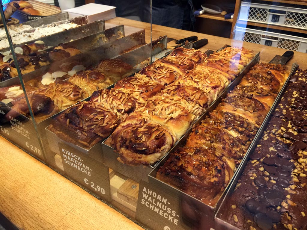
Ensuring that products are displayed next to each other in an homogeneous way makes information processing easier for the customer. During our retail tour in Berlin we spotted a few of this well-designed products arrangements.
In our article on the newest New Era store you may have noticed parallel displays of vividly colured caps on a dark background.
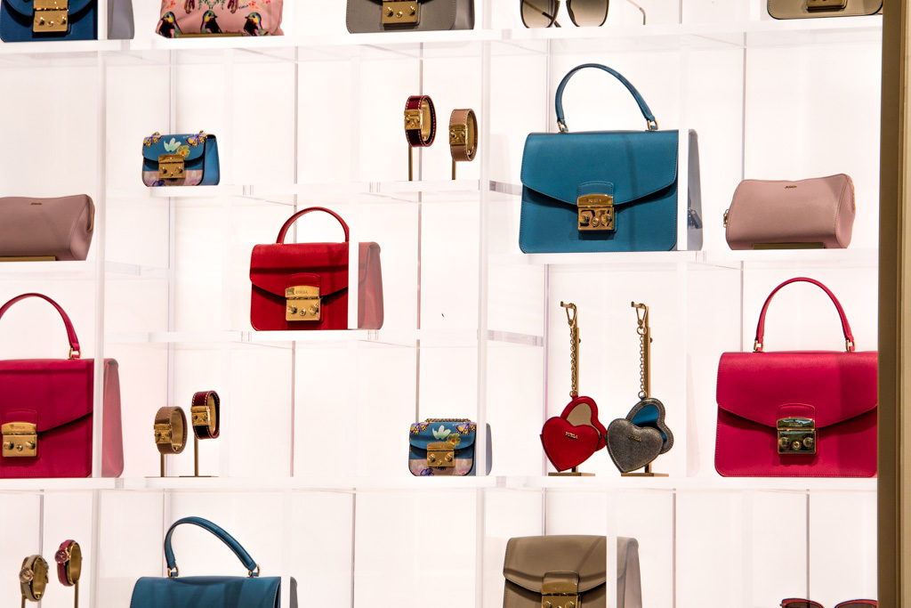
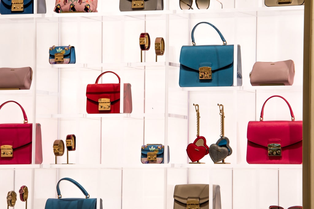
Another good example was spotted at the Furla store on the famous Kurfürstendamm, Berlin’s longest shopping avenue. You’ll certainly notice the symmetry and the repetition of the same products (in different shades though) which helps the customer’s brain make sense of what he/she sees and facilitates the purchase decision.
Yet another example was found at Zeit für Brot, a trendy bakery located in Berlin-Mitte (we interviewed its founder Dirk Steiger a few years ago). As you can see on the image below pastries are prepared in the same exact mold which creates, when they are displayed, visual cohesiveness and makes product comparison and purchase decision easier.
Designing your store and tour processes to facilitate purchase decisions
In conclusion, always think about consumer behavior when designing your store and your processes.
Too often retailers loose customers because of poor design that makes purchase decisions cumbersome.
There are several key conversion points that can be improved. If you want to know more and continue this discussion, feel free to call us or to drop us a line. We’ll be happy to share our findings and thoughts with you and to help you improve your conversion rate.


