Choosing a good article design is essential for a good SEO: The longer the time spent on the website, the lower the rebound rate, the higher the satisfaction. We have analysed eight designs that stand out and deliver all the best practices to make your website a model of its kind. Detailed explanations in this guide that will inspire you and complete our post on updating old articles.
Summary
- Why good article design is essential for your SEO in 2020
- The magic recipe for a successful blog article
- Example 1: The New York Times (US)
- Example 2: The files of La Libre (Belgium)
- Example 3: VRT (Belgium)
- Example 4: Fig Data (France)
- Example 5: Neil Patel (US)
- Example 6: Brian Dean (US)
- Example 7: C-marketing (Belgium / France)
- Example 8: IntoTheMinds (France / Belgium)
Why good design is essential for a blog article
I’ll leave the technical aspects aside (this is not my cup of tea) and try to explain SIMPLY why it’s vital to stylise your blog posts.
Do you know how your ranking in Google is determined? So, of course, there is the authority of your website, the length of your content, but there is also the bounce rate, the backlinks, the time spent on the site. Maybe you don’t realise it, but the design of the item (its format,) is a factor that plays a role in all this. Imagine a breathless piece of text. Who wants to read this? 100% rebound rate guaranteed, and no one will want to recommend it to other readers (so no backlinks).
A suitable article format is an assurance of satisfying the visitor by:
- allowing him to find the information he is looking for quickly (google will reward you for that)
- entertaining him with a different (but effective) presentation
- keeping him on your site for more extended periods
80% of Internet users do not scroll
For 13 years, I have written more than 3500 articles on this blog and have optimised my practices as I go along. My blog articles have, therefore become more productive. In today’s article, I analyse eight designs of articles that I find terrific. The 8th is our ?, and as you can see, there has been quite an evolution in 10 years.
The magic recipe for a winning article
In the years that I have been writing (myself) and being deeply involved in the SEO of my blog, I have learned a lot. I hope my competitors don’t read this because I’m going to tell you my little secrets:
- Use numbers: people love numbers, stats. It’s easy to digest and will make your article credible.
- Don’t forget the summary: no one scrolls anymore. You have to go directly to the news. So too bad for those who forget to include a summary.
- Write a header: the header is what will keep the reader on the page. Spend time writing it well to convince him to read the article.
- Mix the formats: who said you should only put text? Let your readers breathe by inserting images, videos, animated gifs and of course, podcasts.
- Provide inserts: to make the information digestible, make inserts with small summaries. Feel free to repeat the info by summarising. It will also break the post into small but more manageable sections.
- Use colour codes: there is nothing worse than an article written in black. Use a style sheet (CSS file) to define flows
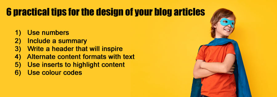
6 practical tips for a successful blog article
- Use numbers
- Include a summary
- Write a header that will inspire
- Alternate content formats (video, podcast, images) with text
- Use inserts to highlight content
- Use colour codes
It is now time to move on to the demonstration.
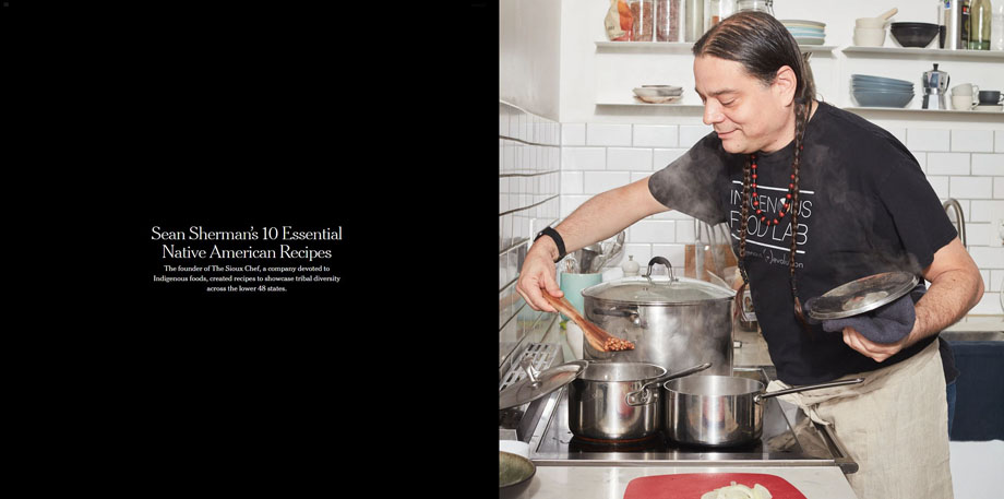
Example 1: The New-York Times
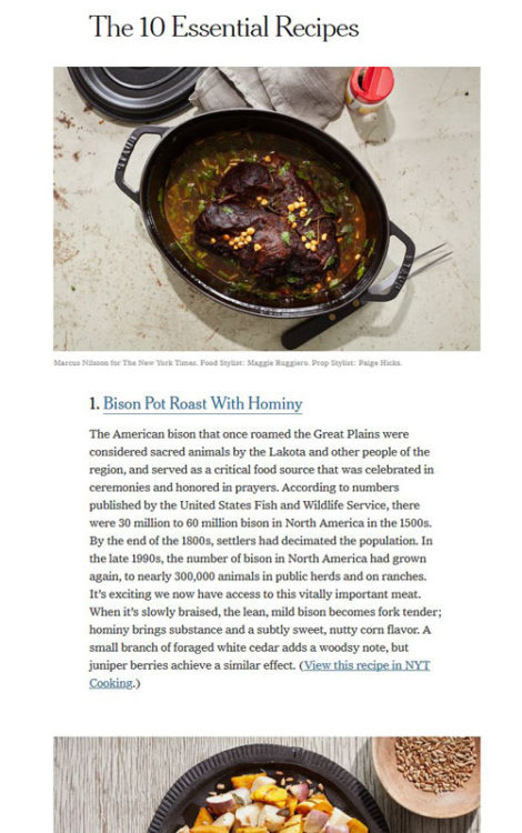 For my demonstration, I have used this article on Sioux Indian cuisine. The New- York Times also publishes articles with a much more classical design, but I particularly like this one. A large image to start with a short text (left) that appeals (see screenshot above). Further down in the article, there is also a succession of images and short texts organised around a list (see opposite) to present the different traditional recipes.
Good ideas to remember: the large image (which is also responsive) and the “list” format at the bottom of the article (where recipes are displayed) that alternates images with short blocks of text
To be reviewed: too much text at the beginning, which gives a rather uniform appearance to the ensemble.
Example 2: The files of La Libre Belgique
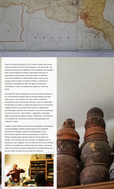 The Belgian newspaper La Libre sometimes publishes very detailed dossiers which are highlighted online thanks to a careful layout. The one on the reopening of the Museum of Africa in Tervuren (Belgium) deserves our attention. The file is presented in its digital form with a large image (like the New York Times), the layout is much more sought after (too much?) than that of its American counterpart. We notice the background image onto which the text is superimposed and the multiplication of interactive elements (video, podcasts, interactive map). I like the upper part of the article, but I’m much less of a fan of the lower 2/3 that is a little bit of a mishmash. This catch-all aspect persists despite the intelligent visual sectioning that makes navigation easier.
Good ideas to remember: the large image, the use of video and audio elements, the division by sections
To review: too many multimedia features, the background used for Soundcloud podcasts that breaks the overall appearance.
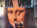
Example 3: Leonardo da Vinci exhibition file on the VRT website
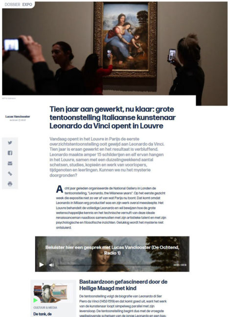 This article is a real masterpiece of design and interactivity. You’re going to stay there for a long time. The main image is large but not too large. The non-textual elements all have the same width, which makes navigation easier and breaks the text well. A podcast episode is integrated and unlike La Libre (see above) the illustration of the podcast is perfectly adapted to the overall appearance of the page AND the subject. I also love the emphasis on specific quotes.
It is almost flawless.
Good ideas to remember: all of them! The intelligent integration of audio and video media in reasonable quantities, the alternation of text and illustrations and the resulting breakdown of the article.
To be reviewed: by cutting the text into small blocks, it is sometimes too fragmented. It also lacks a summary to find the way in this very long article (in size but not in words).
Example 4: Fig Data
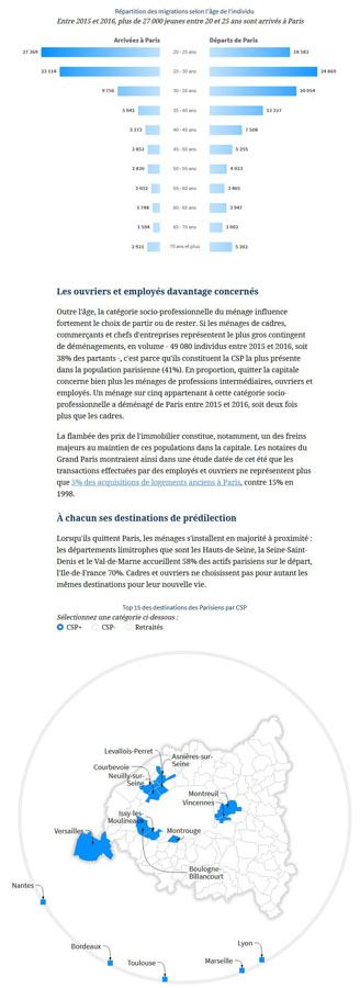 The Fig Data is the “data” emanation of the Figaro. This section contains “data-driven” articles, that is to say, topics. I had already met the manager at a seminar I had organised for the EBU in Munich in February 2019. To analyse the design of their articles, I used a recent example.
What I like, first of all, is the harmony of the colours. The graphic charter of Le Figaro is on the blues, and the computer graphics highlighted in the article are all tinted blue. There is more text than in the previous example of the VRT. This text is aired using graphs and tables. On the other hand, the article begins with a large block of text that is broken only by a piece of highlighted text (one wonders if it is a title or a quotation).
Good ideas to remember: The graphic design that is in a single tone. The good alternation between text and illustrative elements (graphs, tables), the “source and methodology” part at the end of the article which is well highlighted
To be reviewed: too much text at the beginning of the article, the structure of the article which is difficult to understand
Example 5: Neil Patel
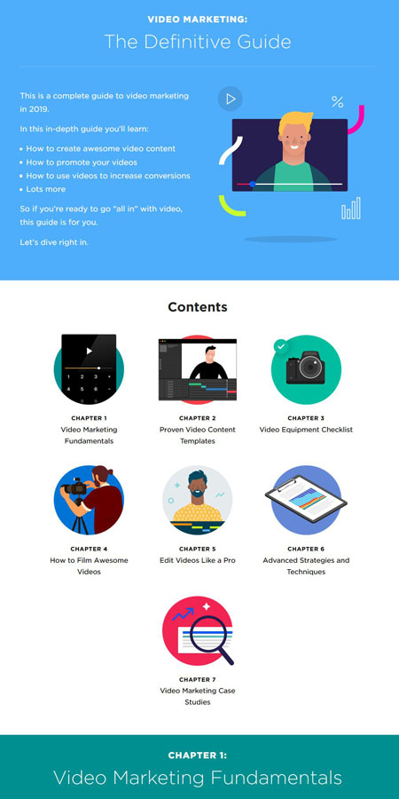
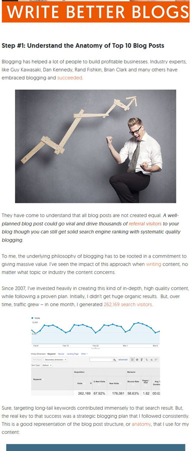 Neil Patel is a personality who counts in the SEO world. So necessarily, his blog articles are a source of inspiration. For today’s analysis exercise, I chose a random article. The overall appearance of his posts is less sought after than the sites we have analysed previously. An exciting feature is that Neil includes many hyperlinks to his articles in the first block of text. As the probability of reading decreases with the length of the article, it is better to put the hyperlinks at the beginning to maximize the likelihood that the user will click on one of them. It should also be noted that Neil Patel puts one of his videos at the top of the article. This is a good idea because the probability of playing it is, therefore, higher and it will increase the time spent on the site. Finally, in his article as in many others, there is an alternation of text (often very short) with elements of illustration. No summary here either but a very well-done computer graphics that “summarizes” the spirit of the article and provides you with the primary information at a glance. We will also note the abundance of numbers and the logical structure in stages (Step #1, Step#2, …) which is easy for the reader to understand.
Good ideas to remember: put your important hyperlinks / a video at the beginning of the article, use a numbering so that the reader can easily understand the structure of the article
To review: a little lack of fun nonetheless and I find that by putting too many illustrations we lose in reading efficiency
Example 6: Brian Dean
 Another SEO guru and therefore, another example to follow. I must admit that of all the samples, this one may be my favourite. His video marketing guide is incredible in terms of design and ergonomics.
The guide is structured in blocks, each with a different colour (practical to find your way around and navigate easily). The intro is clear and punchy, and you get directly to an illustrated summary that is a model of its kind. The chapter structure is straightforward, and you can both understand the complete guide and teleport instantly to the part that interests you.
The chapters alternate between illustrations and text; each chapter also begins with a summary. The different formats (videos, graphics) are present. The videos start automatically (auto-play), which adds playback time to the YouTube channel of the guru. The huge advantage of this type of design is that you can write very long articles (remember that Google loves long articles that can serve as a reference) without sacrificing reading comfort. The disadvantage is that the time required to write such a guide is infinitely longer than for an excellent article (Brian Dean only publishes one article per month) and developing a specific model will necessarily cost you quite a bit of money.
Good ideas to remember: all of them! It’s the best design I know.
To be reviewed: can we not make it a little more straightforward so that development costs can be reduced?
Example 7: C-Marketing
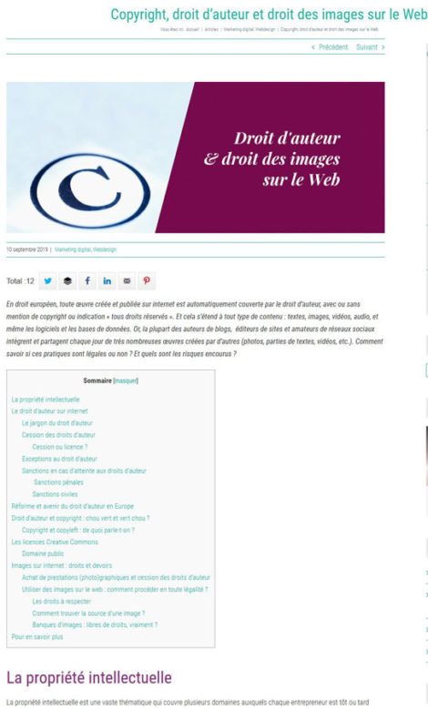 Another website that I like is one of c-marketing. For today’s exercise, I have chosen an article on copyright. Unlike most of the examples, here we have a summary (which is very different from the rest of the article) after a short introduction. A particularity of the site is to put the titles in another colour. I’m not a fan, but everyone has their tastes. I think that the text should remain more homogeneous and that the illustrations already bring enough colour as it is. There is a perfect alternation of videos and images with text, and it is enjoyable. I also like inserts (like the one on “copyright jargon”) which are separate reading spaces; well-structured and easy to read. In short, we see that there is thought behind each article and also a lot of work.
Good ideas to remember: the very practical detailed summary, inserts, alternating text and video
To be reviewed: the different colours of the text
Example 8: IntoTheMinds
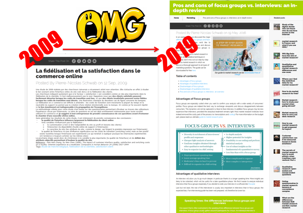
To all lords, all honour. I still want to show that I am putting my advice into practice. You can see below the difference between an article I wrote in 2009 (10 years ago!) and an article from 2016 that I updated in 2019 (see here for more details). From the block of text that was impossible to read in 2009, we moved on to something airier. I highlight our market research guide from the beginning of the introduction, and then I start directly with the summary. Then we get to the heart of the matter and to break the text a little between two paragraphs I added what I call a “summary image”, that is to say, a jpg file that summarises the main points of the article. With a proper file name, this allows me to also appear in the image search results. You will even notice the apple green insert, which will enable me to highlight a particular point.
Good ideas to remember: all of course! More seriously, I like the summary and the ” summarised images ” that we are, to my knowledge, the only ones to do.
To be reviewed: still no videos in my articles (we’ll soon start working on it, it’s a promise), it lacks quotations and an OMG design like the VRT’s one.
Illustrative image: credits Shutterstock