![[Podcast] The essence of Data Art and Data Visualisation](/blog/app/uploads/collage-closeup.jpg)
Nicholas Rougeux defines himself as a “data artist”, and his talent for visualising data is obvious. So obvious that he markets his work in the form of posters and I even got one for my birthday 🙂 Run to his blog (www.c82.net) if you lack inspiration or if you want to see the best in DataViz.
In this podcast, I talk with Nicholas about his creative process, his sources of inspiration, and of course, the technical aspects of his work around data.
Sommaire
- Data art and Data visualisation
- The project British & Exotic Mineralogy
- Technical challenges and tools used
- Ideas, inspiration and realisation
- Nicholas Rougeux’s advice to data analysts

What is the relationship between data visualisation and data art?
What could be the relationship between data and art? We are used to seeing data science as an austere, scientific discipline, which does not necessarily fit in with the creative freedom claimed by artists. Data visualisation is above all, for the majority of those who practice it, dashboards produced for reporting purposes. For Nicholas Rougeux, the art of data is defined by an intrinsic connection with emotions. Classical data visualisation, on the other hand, focuses on information, data presentation and learning.
[The data art] s to present the data uniquely to elicit an emotional response, thus exploring the artistic side and the different ways of processing the data.
Nicholas Rougeux
The variety of Nick’s work shows that anything can be used as an excuse to visualise data, whether to elicit a rational or emotional response. And these dynamic aspects of aesthetics can also be transferred to a business environment. If you’re tired of histograms, why not surprise your colleagues with beautiful reports?

The project British & Exotic Mineralogy
I discovered the work of Nicholas Rougeux a little by chance. Being a passionate mineralogist and a lover of old books, it was a Google Alert that allowed me indirectly to discover the work of Nicholas Rougeux. The latter had published a masterly work inspired by British & Exotic Mineralogy, a 19th-century volume by James Sowerby. His ambition was to catalogue all the British mineralogical riches (see above and here for the online version). Nicholas’s work has received a frankly positive reception in the specialist press, and this is how it came to my attention.
In his work on Sowerby, Nicholas has reworked and rearranged the 2242 minerals illustrated. This work was not without difficulty, and many problems were encountered, especially technical ones (have you ever tried working with hundreds of overlays in Photoshop?).
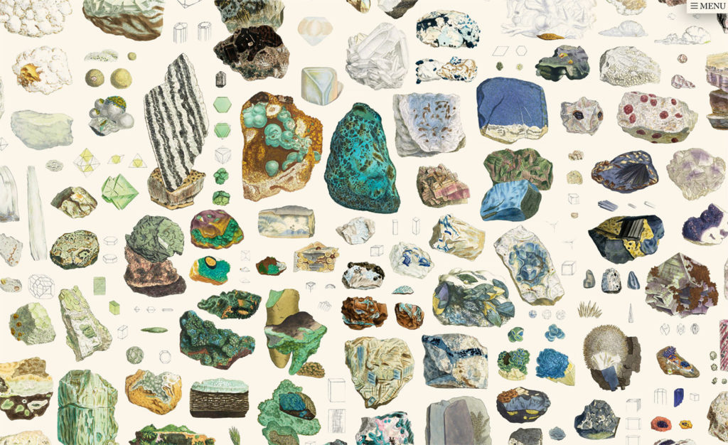
As is the case for many artists, it is from the work of others that inspiration can be drawn (see our article on creativity). This is precisely how the project started for Nicholas Rougeux. He came across these mineral illustrations by chance and thought it would be interesting to sort them by colour. However, the process was not as simple as he thought. Indeed, the old and “faded” images had to be reworked to bring out the original colours. The years tend to age the paper, giving it a more yellowish hue.
What I also like about this project is that Nick has been able to reconstruct the publication history of the various illustrated plates (see below). At the time, the books were sold by subscription, and the author would deliver a certain number of pages and plates per month, which you would then have to have bound. This explains why the most precious books (those whose plates were hand-coloured, as was the rule for all the beautiful books of that time) were incomplete.
Each project is an opportunity for Nick to learn and explore a new field. Mineralogy, before this project, was utterly foreign to him. His attraction to the aesthetics of the samples represented by James Sowerby was the starting point of an exploration of the mineral world. He learned to appreciate their perfect shapes, colours and richness.

The technical challenges and everyday tools
The technical challenges when working with minerals
- How to find the right visual (square, rectangle, colour wheel, and so on) and arrange the colours? Nick did not want to give the impression that the absence of a colour would be noticeable.
- How to organise data and images? There were more than 2,200 images to be arranged on the poster. This involved creating layers for each image, which caused problems in terms of image size and weight. Photoshop soon became unusable, and an alternative had to be found.
Nicholas Rougeux decided to arrange the images manually at first. There was no script, no mathematical formula that could take care of this arrangement automatically. This allowed him to test different configurations before finding the solution that seemed best to him.
The different stages of the data visualisation project:
- Image editing
- Definition of the dominant colours of each image
- Manual organisation of images
The tools used by Nicholas Rougeux
- Photoshop to edit images
- InDesign to work with a large number of images (the prints are not pasted into the project but are linked to the current project, which allows the user to work on the pictures and move them without suffering from the resolution and weight of the images on the project).
- Illustrator
- HTML CSS and Javascript, especially to explore different options not available in other software
- NodeBox to import data and create shapes based on that data and to “generate a large part of the final result”.

Ideas, inspiration and realisation
Nicholas Rougeux explains that inspiration can come from anywhere, from anything and everyone and that, in this sense, it is essential to keep your eyes and mind open. Isn’t this a concrete example of the power of serendipity?
A random tweet, a newspaper article that deals with a subject you’ve never thought of before, can awaken something in you. In any case, it awakens something in me that I fixate on and want to explore.
The implementation phase of projects can be difficult, but Nicholas Rougeux describes these situations as opportunities to learn and grow. The most complicated project to date has been the visualisation of the notes of emblematic classical music (Off the Staff). This work is also exciting, and we encourage you to take a few minutes to view the video visualisations that Nick has posted on his YouTube channel.
This technically complex project forced Nick to raise his skill level and seek technical solutions to problems that nobody had dared to face. The task is indeed a tough one for anyone who wants to convert an audio file into a visual display. As he explains in the podcast, a script was invented on this occasion to convert the data into MIDI format which he could then use in NodeBox.

Nicholas Rougeux’s advice to DataViz professionals
For Nicholas Rougeux, it is essential to know the purpose and intention of a project to align the visualisation of data with it. If it is storytelling, it must be at the centre of attention; if the aim is to educate and illustrate facts and figures, then how the data is shown and visualised will be essential.
You need a visual hook […] to get people’s attention, but I think it’s just as important that there’s a background behind it.
Finally, here are 3 concrete tips for taking data visualisation to the next level:
- Tip 1 : Try, explore, experiment
- Tip 2 : Consult and collaborate with others
- Tip 3 : Draw inspiration from the work of others
Did you like this podcast? Feel free to contact me to be my next guest or to suggest some great people to interview!
Images d’illustrations : Shutterstock