How can migration to EU countries be represented attractively? This is the question I wanted to answer using Tableau Software.
If the question was simple, the answer was not so simple, and it took me a few days of deliberation to find the right solution and the right design.
Below I present it to you with the modus operandi to reproduce it.

Introduction
The movements of migrants (especially those from outside the European Union) are the subject of many myths and fantasies. I wanted to shed some light on this highly polarising theme by visualising data.
I aimed to represent the reality of migrant flows in an entertaining and informative way.
Results
You can see the result obtained below or interactively by clicking on this link.
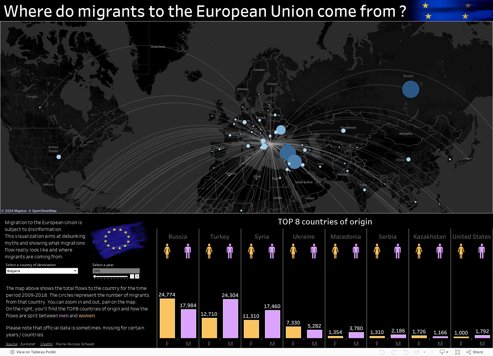
The infographics present 3 types of information:
- Representation of the geographical origin of all migrants to a European Union country (period 2009-2018).
- TOP 8 of the countries most contributing to this flow
- Gender distribution of migrants by country of origin
To change the country, select a new one from the drop-down list. The data are incomplete for France and absent for some countries such as Germany, Portugal or Greece.
Data source and preparation
The data come from Eurostat and can be accessed here. They include the following information:
- code of the country of which the migrant was a national at the time of his/her first application for entry (“first-time applicant” in Eurostat jargon)
- country of destination code within the European union
- gender
- number of migrants
Eurostat gives you the possibility to work based on country codes, the full name of the country, or both. I have opted for the country code. This is indeed a constant governed by an ISO standard. Country names are not, which would have required me to do reconciliation, as I explained in this article on fuzzy matching.
To link the country codes to the country names and their respective coordinates, I used another dataset that allows joining the latitude and longitude directly. It would have been possible to link the country names to their coordinates directly in Tableau. Again, to avoid problems of recognition of country names, I preferred to limit the number of joins within Tableau to a minimum.
The data was prepared with Anatella. For more information on this ETL, I refer you to other articles I have written on this subject, for example, the comparison made with Alteryx or Tableau Prep.

Approach 1
The use of country codes gave me the idea of reproducing a visualisation of aircraft delays by airport that I had seen here a few years ago.
The result was as expected and made me aware of an interesting limitation in the data preparation. It is imperative to export the data in CSV format and to refrain from the output in .hyper or .tde format. Indeed, the method requires to make a union to repeat the data, which is not possible with a .hyper or .tde file. This “data repetition” is the weakness of the method, and I will explain why.
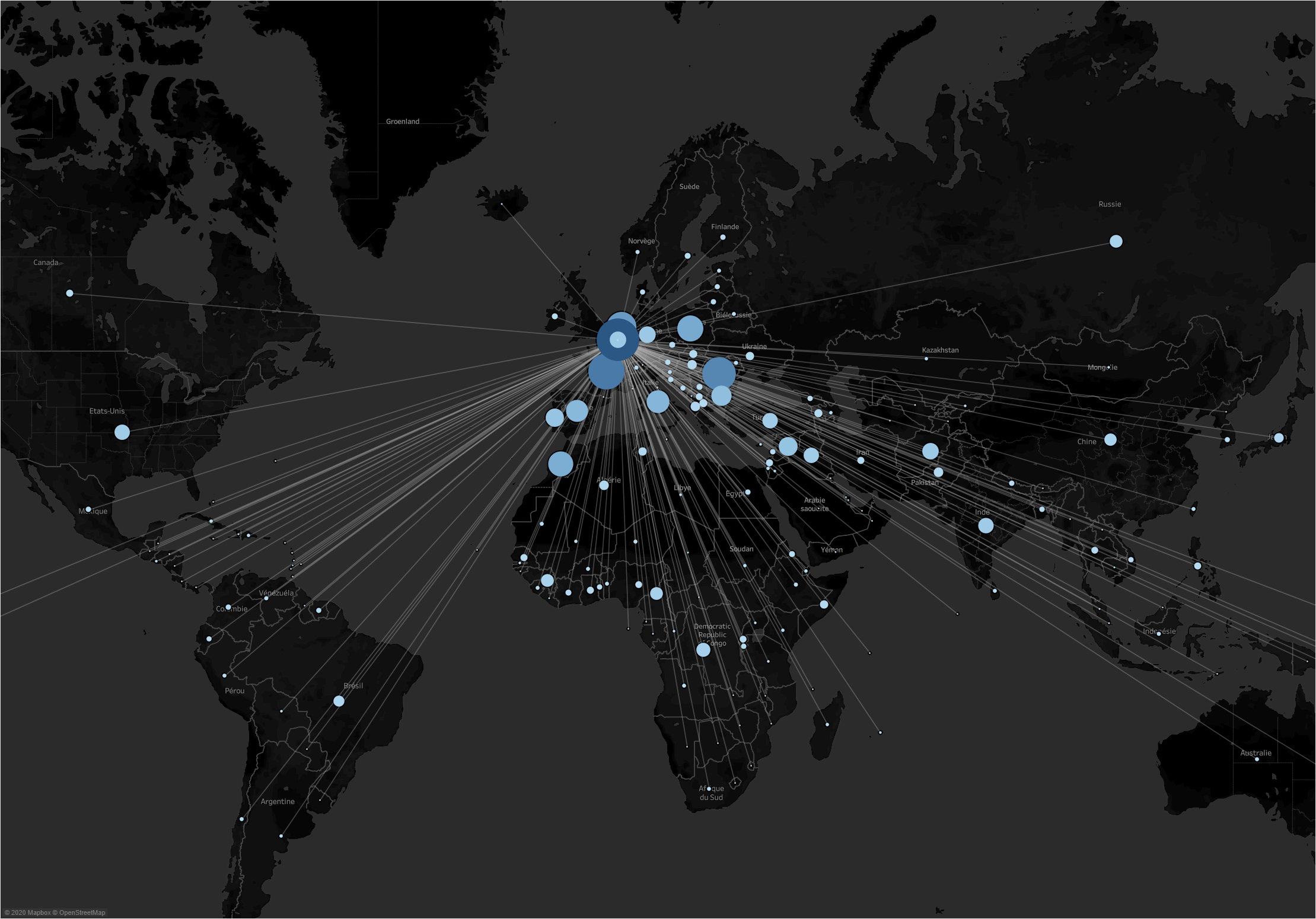
The union that is made based on the same file allows the data to be repeated at the starting point and the endpoint. It is ideal for drawing a line between 2 points and playing on the colour or size of the line to represent a volume, for example. On the other hand, when you have many routes to draw, you have to represent the volume in another way at the risk of losing the user. In this case, I chose circles whose diameter represents the number of migrants. And of course, these circles will be repeated at the origin and at the destination, which will create another kind of confusion (see animated gif below).
Applying a filter on the variable “route identifier” does not provide a solution since it applies to the 2 superimposed visualisations. This is why I developed method n°2.
To remember for approach 1
- needs to work with a source file in CSV or XLS (thus problematic for vast volumes of data)
- draws straight lines between origin and destination points
- repeats data at the start and endpoint which may cause adverse visualisation effects

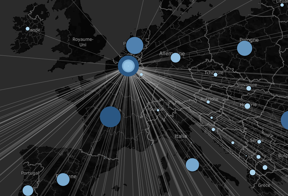
Approach 2
Approach n°2 is based on the preparatory work carried out previously. The idea is to use another technique to visualise the lines between the starting and finishing points. This will allow the circles created from approach 1 to be superimposed and then use “route identifier” as a filter to get rid of the circles stacking up on the starting point.
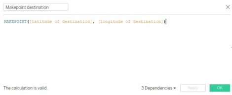
To create the lines (curves this time) between the start and end points, the trick is to use the “Makepoint” and “Makeline” functions in Tableau (available since the Tableau 2019.1 update.
I start by creating 2 separate joins to separate origin and destination (see below).
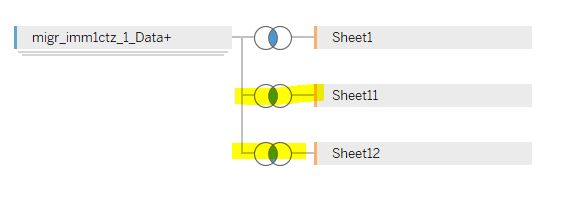
I then created a calculated variable “destination point” with the Makepoint function (destination latitude, destination longitude).
I repeat the operation for the calculated variable “origin point”.
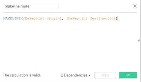
Then you just have to use Makeline (origin point, destination point) to draw the corresponding line.
It is then enough to superimpose the 2 graphics to obtain an attractive visualisation.

Dashboarding
The rest of the work is just dashboarding. After choosing to make the map on a black background, I logically kept this colour for dashboarding. I started by adding a ranking of the top 8 countries of origin.
As Eurostat data also includes the gender of migrants, I thought it would be interesting to report this information visually. In addition to adding a touch of colour, ? the data is far from being uninteresting. You can see that the flows are far from being homogeneous. For some countries, one sex sometimes dominates the other in a very marked way. Iceland, for example, receives mainly Polish migrants who are 2/3 male. As I have been to Iceland twice, I know a little bit about the economy of the country, and this is linked to the fishing industry on the one hand and the hotel industry on the other.
To finish, I added a filter per year which allows you to visualise the evolution of the migratory flows over 10 years, that is to say from 2009 to 2018.

Acknowledgements
I’d like to take this opportunity to thank Marc Reid for his help with the contextual filter, which was a problem for me. Thanks also for the interesting discussion about the choice of colours for the masculine and feminine genders (see here for more info).
Images d’illustrations : shutterstock