The National Institute of Statistics (see our article on the search for statistical data for your market research) make quality data available to all, but it is still necessary to be able to use them efficiently. They are often in their original form and are therefore not easily accessible to newbies. For example, INSEE (the French national statistics institute) produces excellent data on the creation of businesses in France, but it lacks a simple tool to appropriate the knowledge that this data represents. We have tried to overcome this by using business creation data since 2000 (18 years of data nonetheless). So, we have reconstructed a database set and used it with Tableau (a software that helps you to analyse and visualize your results in a few clicks) and made the result available on Tableau Public so that it can be useful for the whole community.
Data exploitation and visualization (so-called “business intelligence”) is part of the services we offer to our customers.
The Source of the data
The data used for this visualisation comes from INSEE, whose data sets are available from this page. We had to carry out some cleaning operations beforehand to make the data more user-friendly in Tableau. You can access the cleaned data source by downloading the tbwx file from our Tableau Public profile or directly from the display below by pressing the download symbol at the bottom right hand side of the page.
How to use this visualization?
There are several levels of analysis possible with this display.
Analysis by region and type of company
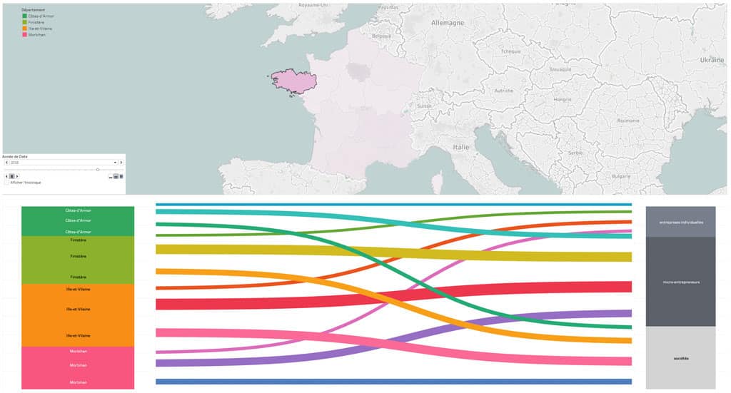
The most obvious way to use this interactive display is to click on one of the regions of France and observe the distribution of new companies within the different departments. And then see what types of companies are in each of the departments. Let’s take the example of the Brittany region; It is composed of 4 departments: Côtes d’Armor, Finistère, Île-et-Vilaine, Morbihan. A simple observation by colour already shows that Île-et-Vilaine is the department with the most businesses created. You can also see (on the right) that the majority of the companies created are of the “micro-enterprise” type. You can click on any region in France to obtain the same type of representation and thus compare the regions with each other. Be careful, however, with some large regions that are made up of very many departments. Since January 1, 2016, and the territorial reform, a region like Occitania has 13 departments, which of course complicates the display of information in a space as small as the one below. The ease of reading the information on such regions may, therefore, be affected.

Screenshot of the interactive visualisation using Tableau showing the creation of companies in the different departments of the Brittany region in 2015.
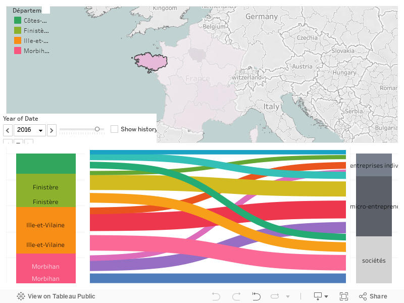
Development over time
The other axis of analysis is longitudinal. It is about observing variations over time. For this purpose, you have a small cursor that allows you to display the data from 2000 to 2018. You will thus very quickly be able to see that a new category of company appeared in 2009 (micro-enterprises) and that this category immediately became a great success as it took the largest share of the structures created. You will also be able to see that this success is the same in all regions.
To finish up
This visualisation uses a Sankey diagram, and the data from the departments consolidated according to the latest territorial reform. Beyond the technical aspect (making a Sankey diagram using Tableau), we think it is a pleasant way to browse a database that would otherwise have been relatively complicated to explore. We hope you will enjoy playing with the tool and are at your disposal for any related data needs that you may have.


![Illustration of our post "SIAL 2024: 12 tips to organize your visit [Guide]"](/blog/app/uploads/sial-2018-etude-de-marche-france-alimentation-1-120x90.jpg)