User experience (or UX) has become a discipline in its own right with the digitalization of our lives. But it does not only apply to online environments. The Italian highway A36, also called “Pedemontana,” offers an example of a catastrophic user experience in the real and digital worlds. Those who designed this highway seem to have wanted to bring together all the worst things in terms of transparency, ease of use, and ease of payment. The resulting catastrophic customer experience leads to maximum customer dissatisfaction that spills onto social networks. The company in charge (Autostrade Pedemontana Lombardia) seems to pay no attention.
La Pedemontana: understand everything about the world’s worst UX in 30 seconds
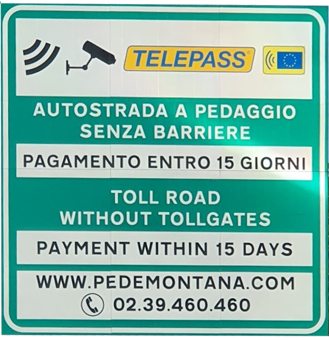
- The Pedemontana is a paying highway. It has no barriers, and the user must pay within 15 days.
- The principle of the Pedemontana (free flow) is counter-intuitive since a paying freeway is associated in the collective unconscious with a toll and an immediate payment.
- The obligations of the users are excessively badly announced (a few signs in Italian at the edge of the highway, difficult to read at 130 km/h): the users are therefore unaware of their obligations.
- The payment process is unnecessarily complicated and random. The time spent paying is much higher than the time saved thanks to the free flow, and the price charged is not transparent. The users are frustrated, and their satisfaction is very low.
- The price of the Pedemontana is exorbitant compared to the other Italian highways
- The dissatisfaction increases even more following the automatic triggering of the collection procedures. Some people wonder if the business model of Pedemontana is not based on the collection of increased invoices. The Pedemontana is, in fact, very loss-making (its cost was 1,4 billion Euros).
Pedemontana: a highway without barriers
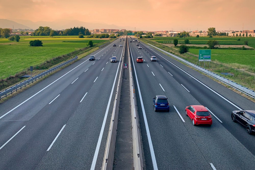
Usually, a toll highway looks like this. You stop (or slow down if you have a Tele pass) to pay at some point. Since its creation, the barrier and the stopping of the vehicle to pay have been characteristic of the toll highway.
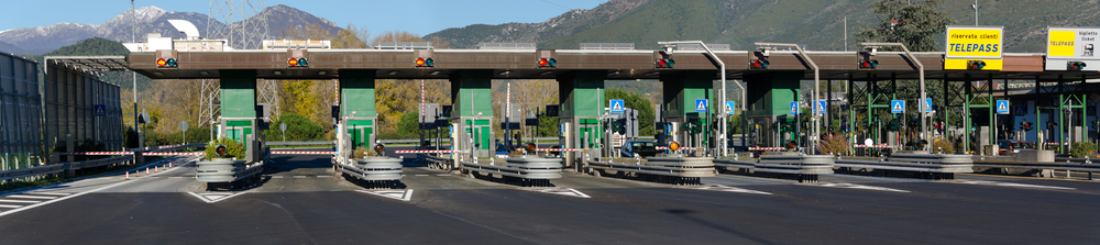
But not on the Pedemontana. This highway, also called A36, located in Lombardy, was opened in 2015. It was designed with a “free flow” payment system without barriers. It is, therefore, up to the user to make, after the fact, all the steps to pay. And that’s where the problem lies. Not only is the signalization not very explicit (see below), but the payment system is so complicated that one might think it is designed to trick users.
The Pedemontana, a highway hated by all users
To be convinced that Pedemontana is hated by its users, you must go to Google. The reviews are irrevocable, and the score (1.3 out of more than 1000 reviews) is the lowest I have seen so far. The answers left by Autostrade Pedemontana Lombardia community managers are bordering on mockery. They could find their place in a manual of practices NOT to follow in managing online interactions.

An analysis of the opinions left allows us to identify the sources of customer dissatisfaction.
1/ Lack of transparency
The first recurring criticism is the lack of transparency of Pedemontana. The signalization, although it meets the standards, is little explicit. Most of the signs are in Italian, and for the passing tourist, it isn’t easy to understand that a payment is due. Complying with payment instructions is even more difficult because, at 130 km/h, it is hard to write down the instructions or at least the website address to consult.
In general, I think the main problem is the innovative principle of this highway. In the collective unconscious, a toll highway is associated with the barrier and immediate payment. Who would think that a payment is due if there are no barriers?
2/ Pedemontana: incredibly complicated payment
The second criticism about Pedemontana concerns the payment. If you were lucky enough to understand that you had to pay within 15 days, getting it done is far from an easy task. The payment procedure is incredibly complicated and opaque. Whether on the Pedemontana website or their app, you’ll need to create an account and fill out the necessary forms to register your vehicle. Then it will display the amount to pay based on the license plate after 24 hours. You will not be out of trouble as you still have to pay. Remember to check your email because you will not get any message if the transaction is refused. However, an email is sent to you (in Italian only, of course) that will tell you if the transaction has been refused, in which case you will have to start all over again. This is what happened to me.
In the end, paying the Pedemontana can easily take you 30 minutes. By shifting the burden of payment to the user, the Pedemontana is a highway that paradoxically wastes a lot of time rather than saving it, thanks to its free-flow principle. This process is, therefore, the opposite of what a successful user experience should be.
3/ Exorbitant price of the Pedemontana
The third complaint against Pedemontana is its exorbitant price. The Pedemontana is not only 3 to 4 times more expensive than a classic highway, but the price claimed is unverifiable. Neither the application nor the website gives you any information about the prices charged, and no information is provided to verify that the price charged is correctly calculated.
4/ Debt collection procedure
Finally, a debt collection procedure is automatically triggered for all users who have not paid within 15 days. This also applies to foreign tourists who have not understood what is written on the cryptic signs. Tough luck for them. Don’t even think about contesting. The claims of the users have been rejected in a recent decree.
The main problem of Pedemontana is the innovative principle of this highway. Who would think that a payment is due in the absence of barriers?
Why La Pedemontana has the worst UX in the world
The very definition of a good UX is to simplify the user’s life to increase his satisfaction. In the case of Pedemontana, everything is done to achieve the opposite: maximum dissatisfaction. Here is why:
- By removing the toll gates, Pedemontana intends to save time for the user. By transferring the burden of payment to the user afterward, it is exactly the opposite that happens.
- The users do not necessarily understand that they have to pay because the signs are not clear enough, especially at high speed.
- The payment procedure is designed in a sub-optimal way. Instead of starting the payment process by providing the license plate, the designers require the user to create an account by filling in a series of information that is not necessary for processing and is disproportionate concerning privacy.
- The application and the website, in addition to being poorly translated or not translated, are full of bugs.
- No information on the calculation of the price to pay is given, which reinforces the suspicion toward Pedemontana.