The Iron Viz is the “world championship” that crowns the 3 leading Tableau developers, a software that allows you to visualise the data. This year I decided to participate also (access my contribution here). In this article, I look back on my experience, what I learned from the preparation of the competition and the difficulties I encountered.
6 tips for a good #Dataviz
- Spend time choosing a rich, quality primary data source rather than making multiple joints.
- Enrich your primary data source with a robust ETL (I opted for Anatella, which I have already discussed on this blog).
- Limit yourself to 2 joins
- Do not use several separate data sources: this prevents a complete story from being told.
- Use a black background for a visual effect that has more impact.
- Define a finite number of scenarios from which the user will be able to choose.
A few words about my contribution to Iron Viz
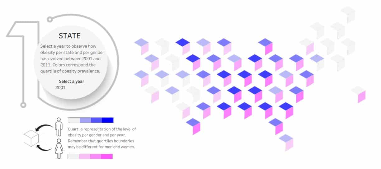
My visualisation focuses on the problem of obesity in the United States and is divided into 2 parts:
- Part A: Obesity in the United States through 2 visualisations: presenting statistics by State in the form of an isometric hexmap, and a joyplot showing the obesity hot spots at the level of American counties (more than 3000).
- Part B: a perspective to put the United States on a more global scale and track the evolution of obesity over the last 30 years

Finding the right idea: the main challenge
This year’s theme was “health and well-being”, a theme ” in tune” with the Covid-19 epidemic. The advantage was that it could be treated in an infinite number of ways; the disadvantage was that it could be treated in an infinite number of ways. Too much choice kills choice and that is precisely the problem I encountered. Where can I find an exciting idea to deal with? What data might be interesting to exploit?
Very early on I was inspired by the relationship between the two terms that make up the title: “health” on the one hand and “well-being” on the other. My initial idea was to use the measure of happiness as an indicator of well-being and to contrast it with another indicator.
It is thanks to long hours of browsing on open data sites that I finally settled on the theme of obesity. All that remained was to find out what to talk about with this data.
 Technique or storytelling?
 Technique or storytelling?
The Tableau Public site is full of beautiful examples of visualisations. Some are surprisingly simple. Others include particularly elaborate visualisations that require complicated developments. The best developers enjoy using Tableau’s capabilities to create new types of visualisations: string diagrams (see Marc Reid’s excellent example here), Sankey diagrams.
The cornelian dilemma that will arise if you decide to participate in the Iron Viz is whether to focus on the story the data tells (storytelling) or on a demonstration of technique.
I chose the 2nd option, and in hindsight, I don’t think it’s the best thing I’ve done. My desire to make a joyplot preceded the urge to tell a story, so I built my contribution to the Iron Viz first around the joyplot before thinking about storytelling.
Favour a finite number of scenarios

It was when I saw another participant’s contribution that I realised that I had made a mistake. While my visualisations did tell a story, actions on one did not lead to changes in the others. It seems to me that the success of visualisation depends on the ability to make the user curious. To do this, you have to make the changes visible.
I think it is therefore essential, in this kind of exercise, to define a limited number of scenarios. Each scenario must correspond to an unusual case, selected beforehand. The selection of this case makes it possible to visualise notable and exciting differences. The Sankey diagram is particularly adapted to this use:
- the differences are displayed as “paths” that the user can follow on the dashboard
- the other “paths” remain visible as a watermark so that you can see the differences
Style: black is a better choice
The visual power of black-field visualisations is undeniable. I have already experienced this with my visualisation on migration to the European Union (see below). This time I wanted to take a chance on a light background visualisation, which was not without challenges. Indeed, the black background gives homogeneity to the whole dashboard that I don’t find in the white background version.

Data preparation
We often hear that 90% of a data scientist’s time is spent on data preparation. In my case, I would say it was more like 50% because the data was already very clean. What took the most time was the reconciliation of the geographic data, especially the determination of the centroids for the county representation. I also spent a lot of time preparing the mesh behind the joyplot. Tableau Prep Builder was of no help to me because I had designed a mesh that was too fine and consumed too many resources.
In the end, I used no less than ten data sources for my contribution to the Iron Viz, and that was a mistake. If I had to do it again, I would spend more time choosing a complete and quality primary data source, and would not exceed 2 joins with external sources.
The positive aspects of my participation in the Iron Viz
Whatever the outcome of the Iron Viz, the big winner is me. The hours spent on this challenge allowed me to learn a multitude of new techniques and to innovate with a new type of visualisation: an isometric hexmap (see below).

The dozens of hours spent preparing for the Iron Viz also gave me new ideas that I will be experimenting with over the next few months to feed my profile on the Tableau Public.
Have you also participated in the Iron Viz? Share your experience in the comments.