In this article, I dissect 6 examples of data visualizations (DataViz) that have more or less serious errors.

If you follow this blog, you’ll know that I’m particularly enthusiastic about data and data visualization. This is the discipline that specializes in the graphical representation of data. And in some cases, it’s an art form. In today’s article, I propose a dive into avoiding mistakes. In this article, you’ll discover 6 more or less seriously flawed data.
Contact IntoTheMinds marketing research agency
1. A treemap that gives you a headache
This type of data visualization is called a “treemap.” It is used to represent values in the form of areas. The largest area is at the top left, and the smallest is at the bottom right. The treemap you see is intended to classify countries by number of inhabitants and continent.
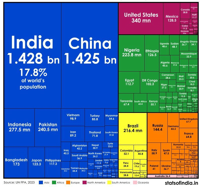
Errors made
This treemap contains several errors:
- First, there’s a redundancy of information. Since the treemap classifies values, its creator should have questioned the need to include values. At the same time, if values weren’t included, this data would be useless. The human brain has great difficulty in comparing different areas.
- I defy you to read the values in the bottom right-hand corner. It’s illegible and, therefore, useless.
- The continents are not classified according to the treemap principle. This is a more subtle error
2. Areas that are difficult to compare
This data visualization shows the imports of different countries worldwide and the share of Russian gas in these imports. A color is added to indicate the continent. If we disregard the continent, there are 2 variables to represent.
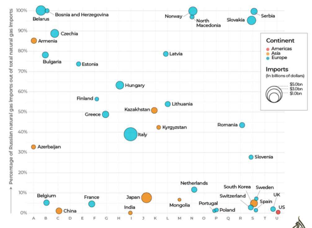
Errors made
Several errors have been made:
- The use of areas makes comparisons difficult. For example, can you tell me whether Sweden imports more than Spain?
- The abscissa scale is incongruous and redundant, with country names above each data point.
- In the end, the contribution of colors is weak. There is only one country represented for the American continent.
The solution
2 scales with continuous variables should have been used. Gas share on the y-axis conducts the task perfectly. The number of imports should have been on the x-axis.
3. An unnecessarily complicated histogram
Even the most innocent histograms can turn out to be horrible data visualizations. This one is one of my favorites. The reactions are epic when I show it to someone for the first time. It takes a long time to understand what’s being represented. And on several occasions, I’ve seen people drop out because of the cognitive load involved.
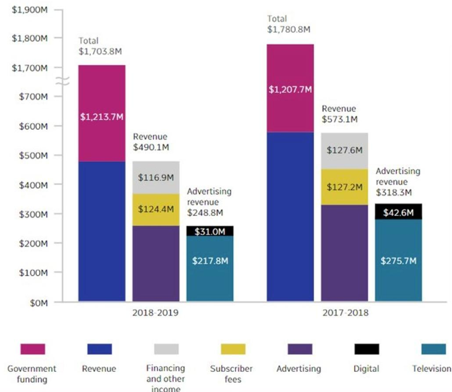
Errors made
So many mistakes have been made that I find it hard to know where to start:
The abscissa axis is inverted (the most recent period is on the left), and it’s unclear what the 2 dates represent. It’s a comparison or a temporal period straddling 2 years.
The 3 bars raise questions: how are they related? What are they conducting next to each other?
Colors are associated with them, which are explained at the base of the graph. This forces the reader to go back and forth between the legend and the histogram to try and understand what he’s seeing.
Explanations and possible improvements
This graph represents a company’s sources of revenue for 2 fiscal years. The bars next to the total represent the breakdown of entries into sub-categories:
- Revenues excluding government subsidies
- Advertising revenues
This DataViz is completely unnecessary. The same information could have been displayed as a single bar. Visual indicators (e.g., braces) could have grouped the information needed.
4. Poor use of color gradient
This map represents the “degree of thermal comfort” between different neighborhoods in a conurbation (Brussels).
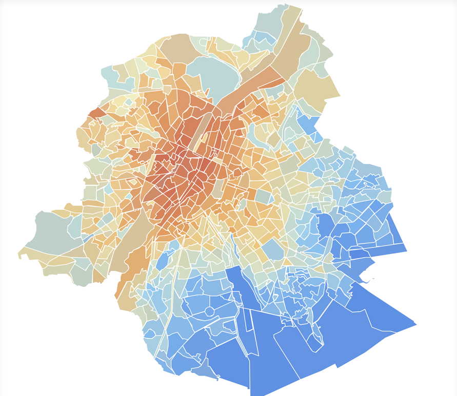
What’s wrong
Two things need to be corrected here.
First, the use of colors. The brain unconsciously associates them with perceptions:
- Red = hot
- Blue = cold
Secondly, the legend does not indicate objective temperature variations.
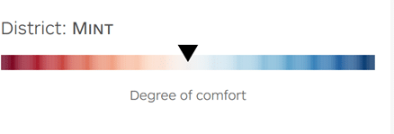
It wasn’t until I dug into the dataset used for this data visualization that I realized that the greatest temperature difference was only 3°C. In other words, the reddest area was only 3°C warmer than the bluest. This is completely misleading.
Solutions for a better DataViz
Using a color gradient other than red-blue would have been more appropriate. This would have prevented misinterpretation of the map. A monochrome gradient would have been perfect. In addition, the values used to visualize the data should have been indicated. A visualization with numerical values is worth more.
5. A 3D graphic to forget
I don’t know whose idea this data visualization was, but they could have been more inspired.
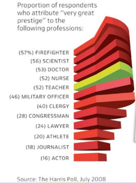
What’s wrong
The use of 3D makes the result unreadable and incomprehensible. There are different shades of red, and I still need to understand why the teachers are represented in green.
For a long time, I thought it was a spiral staircase, but then I realized that the “steps” were, in fact, a pie chart.
What can be done to improve this DataViz
The first thing to conduct is to ban 3D visualizations forever. Nor is the pie chart a visualization to be favored, except when there are only two categories to visualize. Again, the reason is the brain’s difficulty in comparing areas or angles.
In this case, a histogram arranged in descending order of “prestige” (which was the subject of the survey) would have done perfectly well. As the Americans say: “keep it simple and stupid.”
6. The prize for the most useless DataViz
This data should go down in the annals of history. It’s all wrong.
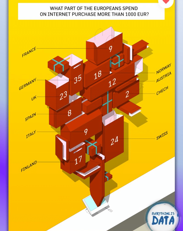
Bad DataViz practices
First, there’s the use of 3D (again and again 😫). Then there’s the arrangement of what I believe to be “gift packages.” Then, there are obvious errors in data representation: the size is not proportional to the data visualized. In short, everything is wrong.
How can this DataViz be improved?
A histogram would have done the trick. The data could have been sorted in descending order.