Patrick Roger is a chocolate maker who has become pretty famous in France. He won the France Best Craftsman (“Meilleur Ouvrier de France”) contest in chocolate making. Unlike most winners Patrick Roger opened several shops with a vision. What I mean with vision is that the Patrick Roger’s shops have an underlying concept and visual identity which is stronger than that of other brands. Take for instance Marcolini, which I visited a few days before. It’s a neat luxury shop with beautifully arranged products. But if you visit several Marcolini’s shops you will miss Patrick Roger’s shops homogeneity.
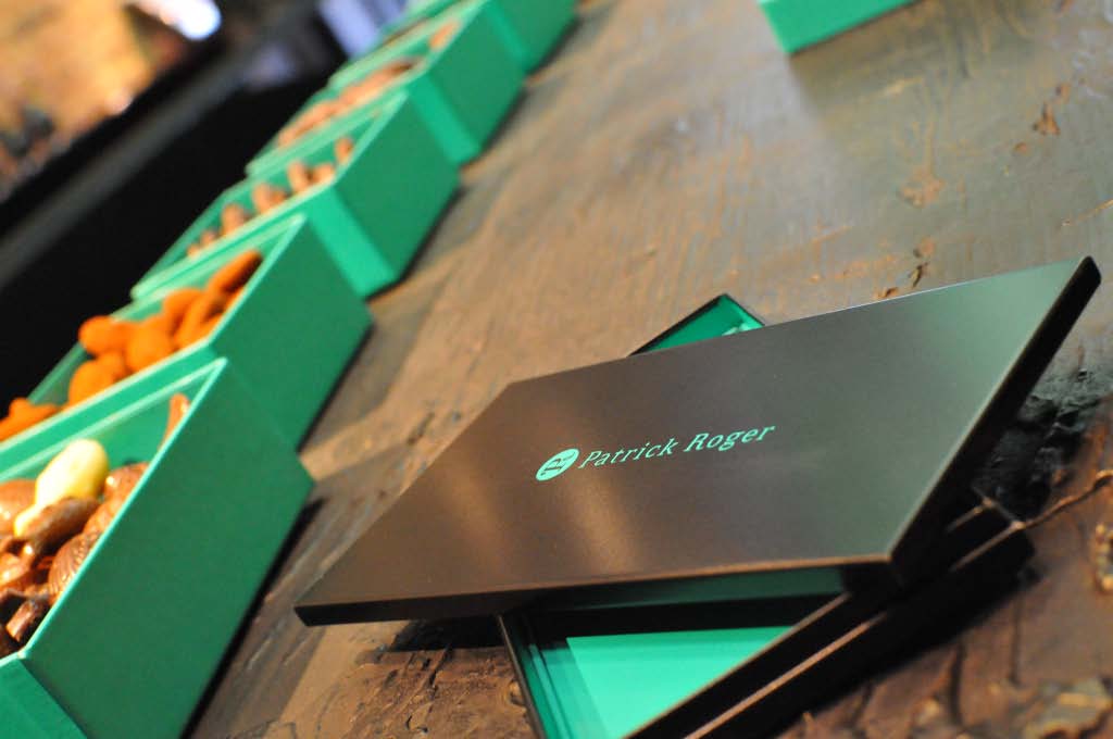
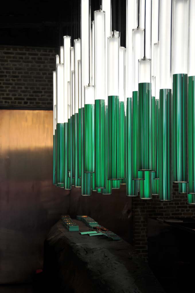
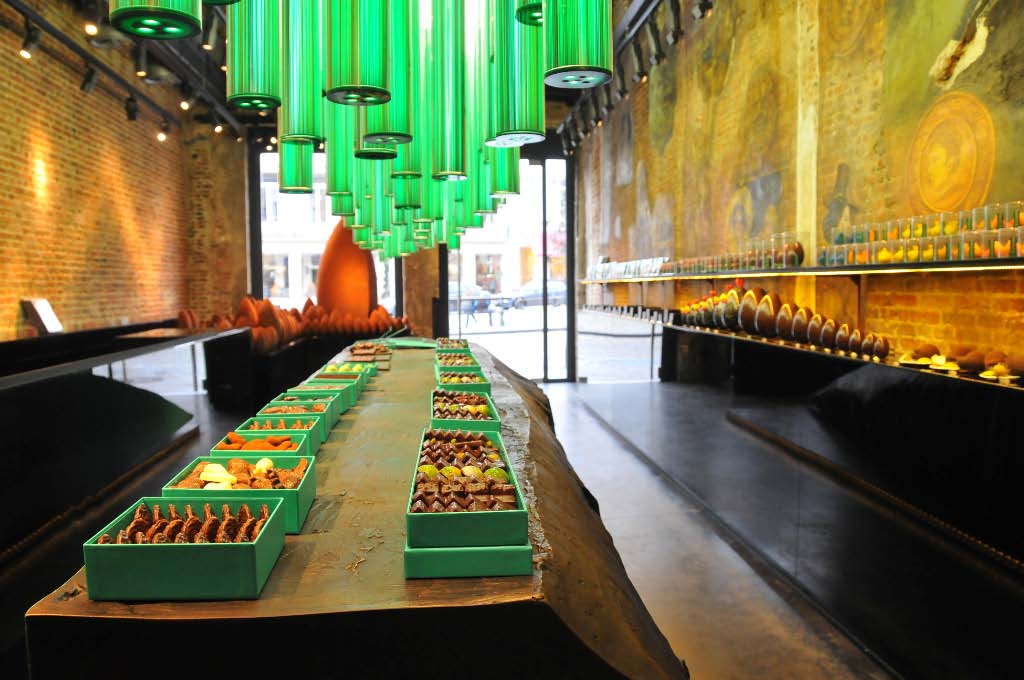
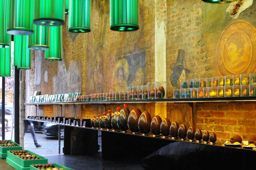
Patrick Roger provides a very consistent customer experience that is structured around the two colors he uses for his communication. Browse the photographs below and you’ll find out what I mean.
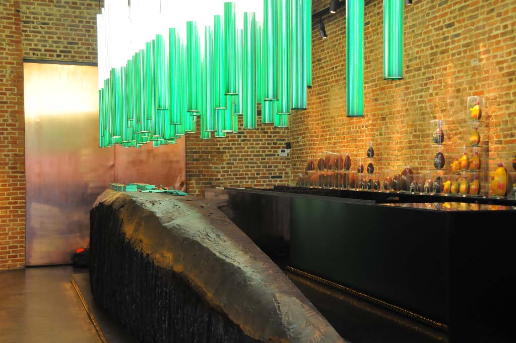
I got the authorization to do a photo shooting session last week and spent an hour enjoying this colorful environment. I must say it had never been so easy to make nice shots (I let you judge). It is a very attracting and eye-catching shop, one of those that enter my top list in terms of customer experience. It does provide a classical setting except for two “details”. As you can see there’s a central element in the shop which is used as a central console to display one exemplar of each product (note that those are only samples and that this central console can therefore be considered a “mere” exhibition tool). This console also allows to manage the flow of customers who walk along the products on the left-hand wall before entering the area where employees are available to compose the customers’ own mix of favorite chocolates.
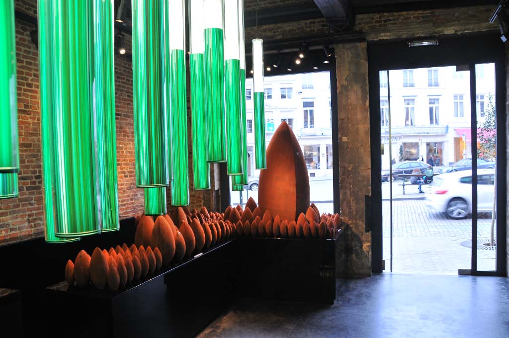
The second “detail” is the shop’s window which is thought as a “show” rather than a mere display of product. For Easter Patrick Roger had imagined giant eggs that attract customers inside.


