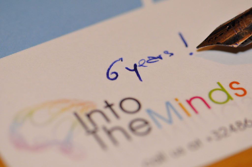
As most of you noticed we launched a new version of the blog just before Christmas. It’s now the third version in 6 years.
The story of this blog on marketing started on May 24th 2008 as a blogspot presence and, in parallel, as a blog on the French magazine Capital.fr
With the development of IntoTheMinds’ activities in market research, customer satisfaction consulting and entrepreneurs coaching, I felt the need to give the blog a more professional look. In 2010 we created a very simple design to break from the general look of blogs at this design : crowded pages with ads and tags cloud impeding the readability. The emergence of mobile terminals made us necessary in 2012 to change the code to make the blog responsive but it all came to a cost (not only financial) as we adding complexity and were trying to change old code.
This blog had been online for 3 years and we felt it didn’t fit anymore with the current trends in terms of design. That’s how we decided this summer to start from scratch again.
In search of a new visual identity
We reviewed dozens (not to day hundreds) of personal and professional blogs to understand what was going on in terms of design. One conclusion was obvious: personal blogs often looked the same and used very simple templates; on the opposite professional blogs or information website often looked crowded and lacked a strong visual identity. We couldn’t really find one blog that looked perfect to us. Rather we found interesting elements in many different blogs :
– Gameological proposed a very interesting typography as well as a very clear and cutting-edge layout for the articles. The title was big enough, followed by a big image and the author appeared very clearly. Another interesting feature was the buttons to share the article at the bottom of the page. However we didn’t like the color and style of the hyperlinks (which were not obvious enough for us) and the image at the top of the post reminded us too much of the old design
– the 9to5mac.com website had this very cool grayish citation block that gave us the idea to include a text block to sum up each post in one sentence. You’ll now find on top of each article a tiny little green box where you’ll be able to get your daily dose of inspiration in just 5 seconds. Isn’t that cool?
– creapills.com strong identity (bold letters and 3-column design) was one of the most inspiring example we found. We loved the categorization of posts (Arts, technologie, marketing, …) and the homepage but found the layout of the individual posts remained too complicated
– finally bienfaitpourmoi.com had a very interesting way to display images at the bottom of posts
And the result is …
I let you judge / appreciate the final result by yourself
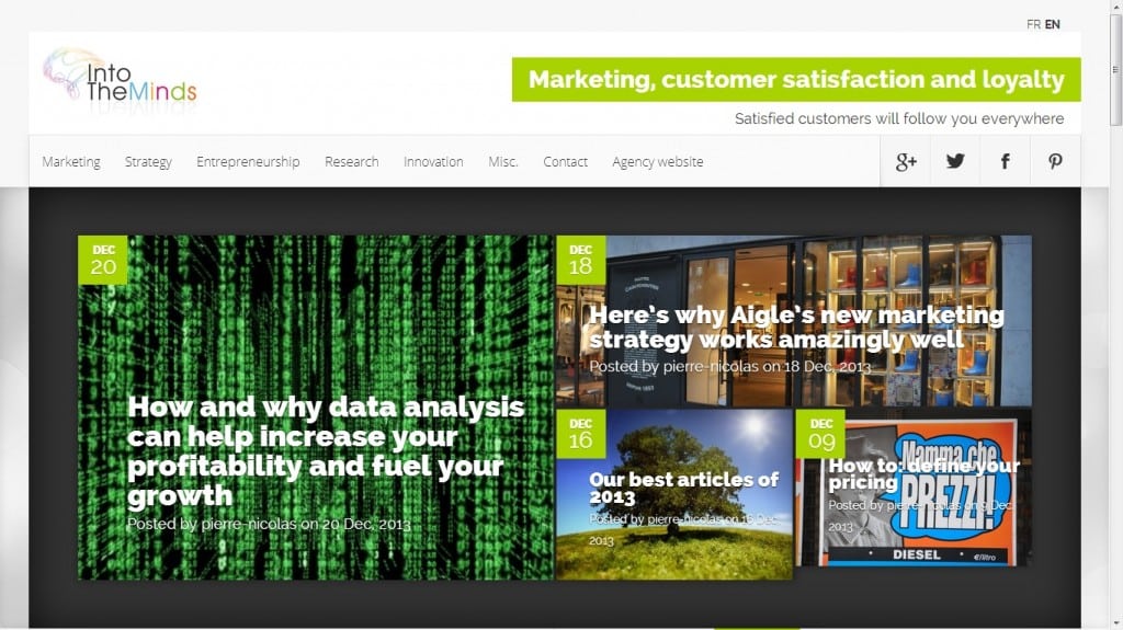
The homepage displays on top several interesting features : a categorization of the posts (we had to re-categorize all 1000+ posts published on both the French and English versions of the blog) and a dark gray horizontal bar with the latest posts about marketing.
We took over the 3-column layout and wanted, next the latest posts published, propose our readers to discover (or read again) older posts. This was not possible in the old version of the blog where readers had either to search for a specific topic or browse the archives. We try here to be much more proactive and propose you a content you may like.
Scrolling down you’ll also discover in the first column the all-time most popular posts and, further down, the latest articles by category (which you can obviously also display by simply clicking the category you like in the top menu).
Last but not least we have added a more powerful search engine (on the right), have simplified the way comments can be posted, and have also decided to go to MailChimp to manage subscriptions to our blogs.
In conclusion
Rather than describing at length all the changes we made and why we made them, we prefer letting you experience the new blog. Just browse it, read what you like, and please … do leave comments and share the content you like. An increased audience represents the highest motivation for us and will fuel us with an incredible amount of energy.