Doing data mining can become a quickly exhausting exercise if you don’t know where you are heading to. People can easily get lost and draw erroneous conclusions. Read further and discover a tool that will change the way you manipulate and represent data.
Exploratory factor analysis
The exploratory and confirmatory factor analysis (EFA and CFA) provide numeric ways to explore the data and to build tentative models. In the end, data mining remains a research exercise where you try to understand what’s going on in the “real” world from a bunch of data. Many people fall however in the trap of drawing correlations that don’t exist. This is probably a natural tendency of people to limit their efforts which makes them quickly jump on conclusions.
This being said EFA is not the most sexy way to understand what’s going on. Visualizing data may be helpful.
Tableau software helps you visualize your data
I came accross a new tool last year that may prove very helpful in your next data mining exercise. And the best is yet to come : it’s free !
This grail has a name : Tableau; a pretty strange name for a software but as long as it delivers, who cares ?
Tableau can be considered a pre-statistical package, a very advanced version of Excel. I know the guys of Tableau are not gonna like it but many of the tasks you struggled with in Excel can be done in Tableau. You’ll like the interface that will remind you of pivot tables.
One example ? Here it is.
Now it’s time to give you one example to raise the desire in you.
You know I’ve been working on customer complaints and complaint handling. We have published many articles on the subject (see for instance this one, or this one).
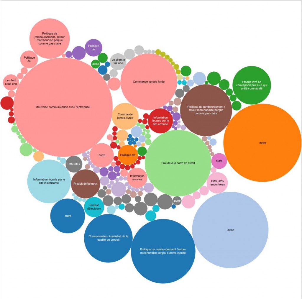
I still have a lot of data to exploit (some 22000 real complaints that were archived from the online complaint forum Les Arnaques). Those 22000 complaints were coded to give them a very simple tag : what is it that caused the complaint. Instead of working with percentages I thought it would be better to upload the data in Tableau and manipulate in there.
The most basic graphic you can produce gives you an idea of the weight of each complaint rootcause. A table with percentages would have done the very same job. I agree. But I still find this graphical representation is so much easy to understand. You don’t need to read the figures. In a few milliseconds you know where to look.
Conclusion
I know some of you will find the above example overly simplistic. But it is actually so simplistic and easy to compare with the traditional way of working that everyone will understand it. I kept the best for the end. It took only a few seconds to produce this graphic.
Photo: Shutterstock
Posted in Marketing, Research.